Archive

living room

img_9557

so, remember like 3 months ago, when i stupidly thought i could “get ahead of the game” and start thinking about floor stains? SILLY, SILLY SARAH. if i could go back in time and warn 3 months ago sarah that basically NOTHING would go as planned and that there is really no way to get that far ahead of ANY of this…

well, let’s just say i would.

anywho. in case you missed the post above (clicky clicky, friends!), 3 months ago sarah thought it was as simple as choosing between “light” and “dark” – HAHA. SILLY, SILLY SARAH! TIS NOT THAT SIMPLE, GIRLFRIEND. turns out that, just like paint colors, floor stains come in basically every shade under the sun…AND YOU CAN MIX THEM. which means that there are essentially ENDLESS possibilities.

my floor guy, lou of finishing touch floors, told me that my first step was to take a look at the minwax website and get a feel for the colors. he thought i might be interested in a shade known as “special walnut” (teehee). so over i went to minwax, where i found this very helpful (read: not helpful at all) graphic.

cc9e01b7f985684d398733aa34239dc0

do you see special walnut up there, number 224? it looks OH SO REGULAR, right? REG CITY. so i turned to my friends google and pinterest, to see what they could show me about special walnut.

761c6891ab687ea26448b87eb058fc2c

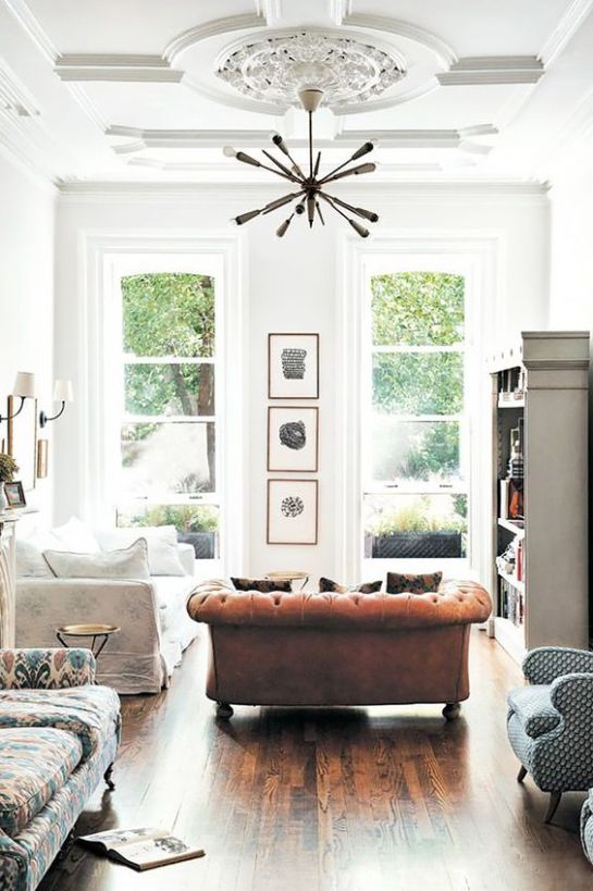
….pretty regular. so i decided to hunt around on pinterest to see what others liked. as it turned out, special walnut was, surprisingly, pretty popular (#bland, america). people also had quite a thing for english chestnut, weathered oak, and early american.

so i asked lou if we could see a few (read: a bunch) of samples. and on tuesday morning, that’s just what we did.

img_9546

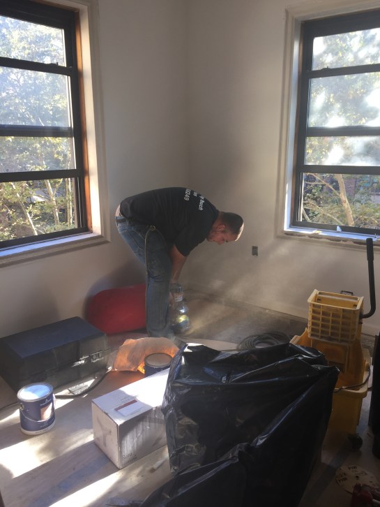
lou’s worker, eric, sanding down the floor for stain tests.

img_9549

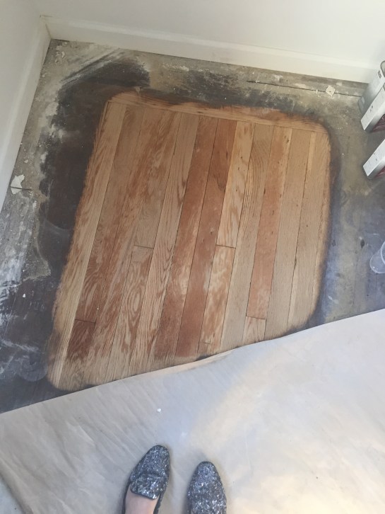
amazing how much dirt/stain/grime/life comes off with 5 minutes of sanding, isn’t it? i couldn’t believe how beautiful the hardwoods were in their original oak form. imagining this room being built way back in the 1920s gave me all the feels.

once the floor was sanded, lou wiped it down with water and let it dry, creating a spotless surface for us to work with.

img_9555

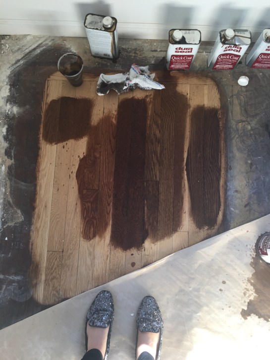
here he is opening all the various stains and prepping them in little plastic cups.

img_9560

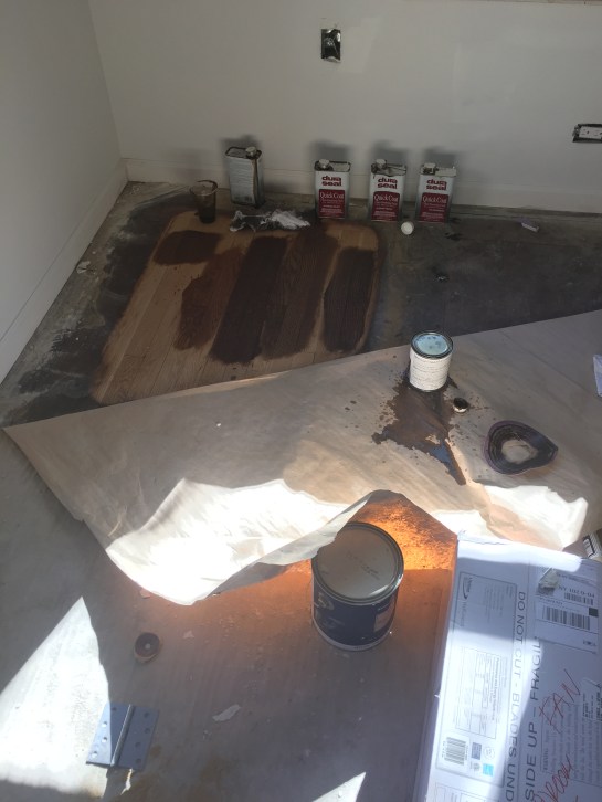
and here they are all laid out. i immediately ruled out the far right and the third from right – too dark. second from right is special walnut, which, not surprisingly, looked REGULAR, just plain old REGULAR brown, on my floors. the middle dark one is “english chestnut” – pretty, but a little too red/dark for my liking. second from the left is “early american” – meant to make your floors look, well, early american. which mine are.

img_9558

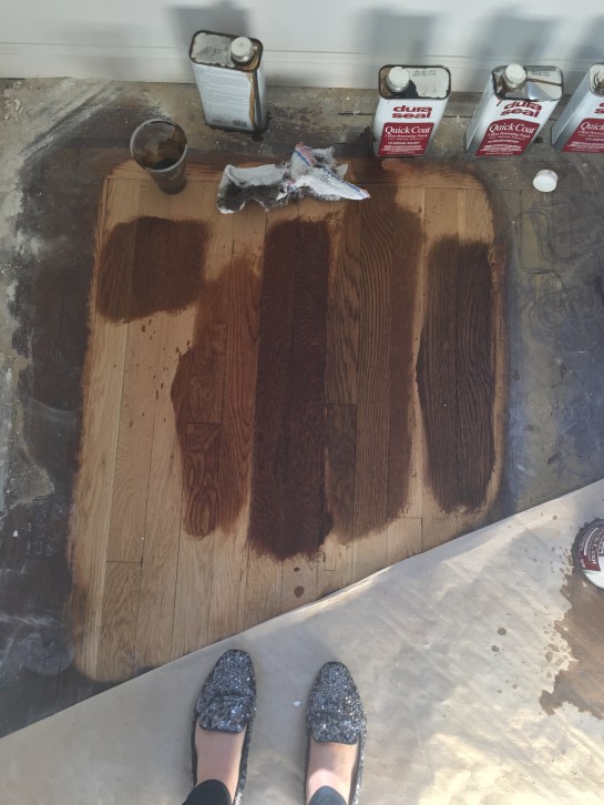
here’s a closer look. so, on the far right, we have a dark brown (i forget the color, apologies!) mixed with weathered gray. on the far left, we have the same mixture, but two parts gray to one part brown. far right might have worked if i wanted to go dark; far left felt drab. second from left is (ding ding ding!) the winner, early american. next to it is english chestnut, which read waaaaayyy too red on my floors (they’re oak, by the way, for those wondering). next to english chestnut was special walnut, looking as drab and brown as they come. apparently, this color really sings on some floors, but on mine, it was like that guy that auditions for the voice and is so horrifically bad that you wonder how he made it past initial casting, let alone got in front of blake and adam.

so, what happens next? after i left, the guys got to work, patching the part of the floor that had been ruined when we took down the wall between the entryway and the kitchen.

IMG_8145

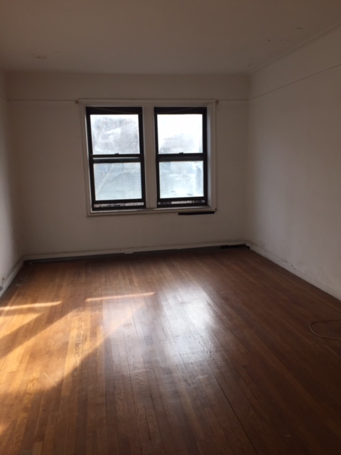
remember when the living room/entryway looked like this?!

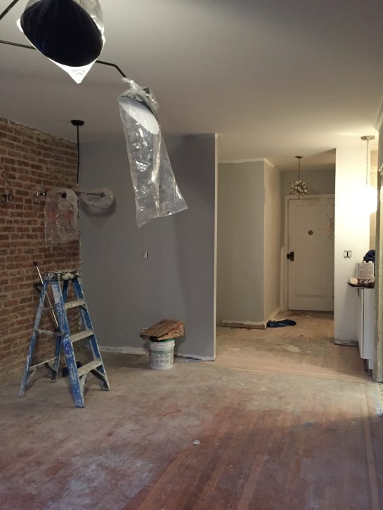
the “newer” looking floors you see below are, well, brand new. and magically, just as he promised, lou managed to match them to the old ones. he’s warned me that once stained, the new planks won’t be exactly like the old, because the new wood will take the stain differently than the old floors will, but to me, things look pretty damn good.

img_9578

for reference, i am standing at the very front of the living room; to my left is the dining area, to my right is the breakfast bar (where those cabinets are)

today, lou and his guys are sanding and staining, and by friday night, i’ll have shiny, fresh, beautiful floors. EEK!

just for funsies, let’s take a look at where the living room was when construction started…

grandapt_before_LR

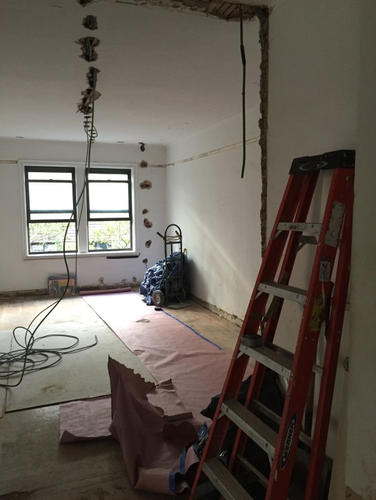
pictured at closing – doesn’t it look so much smaller without the brick wall exposed?

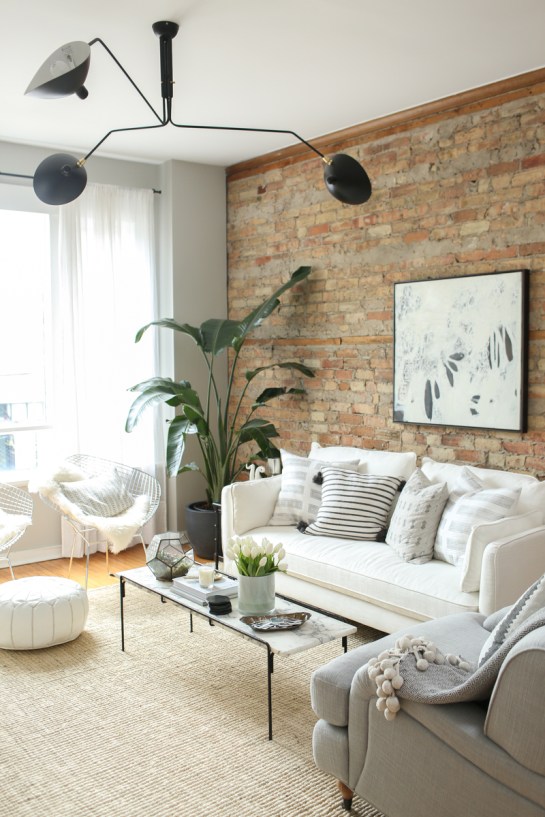
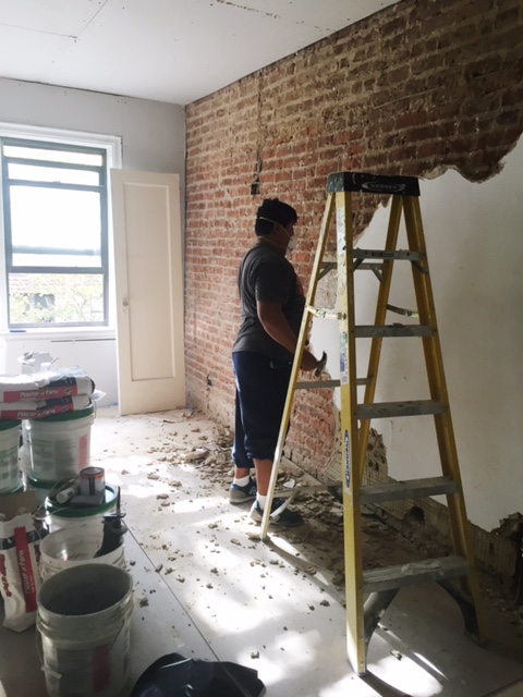
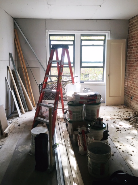
and where it is now, with the brick wall exposed, the lighting up, the front wall painted, and the floors ready for stain.

img_9577

kind of crazy, right? i have a feeling things are about to get GOOD.

656f69594b0c41125d9eafea537abbc0

one of my “must haves” during my apartment search was the ever elusive “pre-war charm” — i wanted an apartment with history, an apartment where the walls told stories and the floors were worn with wear.

happily, i found that charm in the grand apartment. original door frames include some seriously intense molding, the bathroom door contained an old crystal doorknob (!!), and the floors were beautiful old thin oak.

and then, of course, i discovered the brick in my living room. you’d think i’d have been satisfied at that point, but no. i wanted MORE CHARM! so i asked my contractor to install crown molding on top of the kitchen cabinets and around the living room walls.

7651412c0ec58be25075cde39d3d8d40

my next goal? to hang ceiling medallions around my three main lights in the living area (living, dining, entryway) to make those light fixtures (my splurgiest, coolest ones) truly pop. for example, how cool is the one above?! i love how it turns a (still very interesting) light fixture into a true statement. medallions are a little more baroque paris than pre-war NYC, but i still think they can work in my space (which is obviously a lot less impressive than the one above, on ALL levels).

here’s what i’m thinking (light fixtures have already been purchased, for dining area, living room and entryway, in that order).

50d5108d072f164258e8ba7e724bec1a

the plan is to order them unfinished, then paint them to match the ceiling color. once they’re up and painted, you’ll never be able to tell they’re not original. and at under $50 a pop, they’re a relatively inexpensive way to add some serious D-R-A-M-A.


did you know that there are approximately 9 trillion shades of gray paint in the world? me neither, until i started searching for “the perfect gray” online. i don’t consider myself to be any sort of color expert, but i sort of thought i “knew” gray. gray and i were old friends! we’d BEEN THROUGH STUFF together!

we’d first bonded in my current place, when i decided, on a whim one rainy saturday morning, to paint my living room and bedroom benjamin moore’s “silver dollar.” gray and i had been tight ever since. together, we’d learned that white was our bestie and brass was our GIRL. we’d been through multiple iterations of gallery walls, we’d tried a variety of mirrors on for size, we’d hung out with turquoise and hot pink. we’d done it all!

aaffe0fa1c6b456dc9bef5c04f6ecfa6

given our long history together, i thought it would be easy for me to choose the perfect gray for the grand apartment. WRONG! me finding the perfect gray was like an episode of true life on mtv: you think you know, but you have no idea. because as it turns out, “gray” translates to a million iterations, a zillion colorways, and WAY TOO MANY OPTIONS.

in my mind, the perfect gray was a little bit of a goldilocks situation: not too light, not too dark. just dark enough to give the space some heart, but not so dark that it felt, well, dark. i wanted cozy but still bright–a surprisingly hard thing to find, especially when you consider that paint colors tend to look different from wall to wall (and also, from day to night).

2955f1a8d5fb4b0235618836fdd02cd3

initially, i turned to the generally reliable pinterest, but that simply led me down a rabbit hole of “best grays for your space” blog posts – none of which gave me the answer i was looking for.

so i did the second best thing (and the thing i should have done first): i turned to instagram. thankfully, instagram delivered (let’s be real, instagram ALWAYS delivers). according to my internet friends, the very best gray was benjamin moore’s “stonington gray.” multiple people suggested it on multiple posts, and that was good enough for me.

CROWD SOURCING, FOLKS. IT’S THE WAY TO GO.

word on the street was that stonington gray was a “true” gray. not too blue, not too brown, not too yellow. just plain gray. exhibit A, below.

3f9ad16810046c57e4e57e293b4d50ae

i also knew that one of my overall inspiration shots (from danielle moss’ amazing scandinavian- esque chicago place) heavily featured the color.

theeverygirl-danielle-moss-home-tour-chicago-web-18IMG_5825.jpg

so good, right?

SO GOOD. except for the fact that there was a small part of me that wanted to go bright white, EVERYWHERE, a la amber lewis (exhibits A and B, below).

cad9fbda5884d4ced8894fa6c5c390a5

049938a08469fcb5c946d55d40e666e5

AH, BRIGHTNESS. LIGHT. SERENITY. HAPPINESS.

to say i was torn is a very strong understatement.

so i did the only thing i knew how to do: i asked someone who knew better than i did.

that someone? a VERY helpful saleswoman at the janovic paint store conveniently located just down the street from my office.

i’ll admit, i was a little bit overwhelmed by the sheer amount of options at janovic (and this was only the benjamin moore line!). so i was thrilled when a very nice looking woman meandered over to me and asked me if i needed some help.

“actually, you know, i do! i’m, uh, i just bought this apartment and i’m renovating it and i need to pick paint colors ASAP and i thought i wanted gray but i also kind of want white, because i want it to feel light and bright but there are SO many whites to choose from, and i heard stonington gray is nice but i’m not sure if it’s too dark…”

did i mention i ramble when i’m nervous?

luckily, this woman knew her shit. she told me to sit tight, and she’d pull some samples. she came back with a few options: stonington gray (which she agreed would indeed be a good gray for me), along with decorator’s white (for the bedroom walls, kitchen and bathroom–basically everything that wasn’t the living room and entryway), and simply white for the trim (a little bit brighter made sense for trim/molding/door frames).

she waited patiently while i showed her photos of my recently discovered exposed brick, and happily grabbed additional grays and whites for me to look at before i choose two colors to make into sample pots. she explained that stonington gray would be beautiful against the exposed brick, and that it was light enough that i could carry it into the bathroom if i so chose. she also told me that while “bright white” was certainly a thing i could achieve, i had to be careful—too white and things could get “a little bit institutional” up in here.

NO THANKS. THAT SOUNDS LIKE THE OPPOSITE OF WHAT I WANT.

so, stonington gray it was (is).

img_9147

it’s rather hard to tell in the image above, but it’s the color swatch on the left, and it’s what i plan to go for in the living room (front wall, back/windowed wall, and entryway). the rest of the apartment will be “decorator’s white” – a white that has just the faintest of undertones (aka, a true white white without seeming institutional). the goal? to have a white that doesn’t make the cabinets or tile look dingy (and vice versa). will it work? WE SHALL SEE.

both the living room and bedroom have been primed, so paint will go up in the next two weeks! EEEK! stay tuned for progress shots!

b0640fe19f01a12c2f35f9120a8f77cc

photo: danielle moss’ chicago apartment 

when i first started searching for apartments, my broker asked me to make a list of the things i wanted. i told him i was sick of living in a 1960s style box with zero charm. i was OH SO OVER fugly parquet floors (helllooo, 1950s) and walls that went straight up to the ceiling with nary a piece of molding in site.

i wanted CHARM CITY, and i wanted it ALL: original hardwoods, crown molding, clawfoot tub…and the real kicker: exposed brick. a true symbol of old new york, of the lives that came before ours.

of course, no one gets it all. not usually, at least. and as of about a month ago, i certainly didn’t. i’d gotten the hardwoods (in relatively good condition, and definitely salvageable in both the bedroom and the living room; the entryway remains up in the air), the molding (you can fake it, just like highlights), and the tub (thank you, clawfoot tub gods!). but the brick was a no go.

as a reminder, here’s what the living room looked like when i bought the grand apartment.

grandapt_before_LR3 copy

here’s what it looked like in the beginning of the demo phase (dated picture rail off the walls, new electrical in the process of being run throughout).

new york city apartment renovation

nothing to see here, right? just some white plaster that was sorely in need of a refresh.

but then. BUT THEN. one morning, before i left for a 10 day trip out west, i stopped in to talk to my contractor about what was to happen while i was away. and through a tiny little rectangle of wall that was being cut out to make room for new outlets, i saw something red peeking out.

i bet you can guess what comes next…

“wait a second…is that BRICK?!” 

“oh, yeah, probably.”

(he leans down to take a closer look)

“yes, that’s brick.”

“does that mean it’s BEHIND THAT ENTIRE WALL?!?!”

“probably, yes. do you want us to find out?”

UM, HELLO! DO YOU EVEN HAVE TO ASK?

DO I WANT YOU TO FIND OUT? HELLS YES, I DO.

let me remind you of my dream:

11beff1c0cb61fdfa13f12cbf193b588

i nodded eagerly, and told him that if there was brick underneath that whole wall, i wanted it exposed. ALL OF IT.

and then i left, and did a little happy dance in the elevator.

a few days later, i got this:

img_8688

by the time i got home from my trip, they’d made quite a bit of progress.

img_8837

img_8854

img_8852

cut to last week, and an entire wall of plaster had been painstakingly scraped off. my exposed brick wall was free, in all its glory!

it’s a bit surprising, actually, considering that this isn’t an exterior wall (the exterior of the building is indeed brick, but all the other interior walls we’ve torn into are old wood/plaster situations). it’s a wall that’s shared with the apartment directly beside mine.

as you can see below, there are old electrical boxes in the wall – likely where the original tenants had sconces – which means that a) this brick was original to the apartment and b) at some point, someone CHOSE to cover it up.

img_9066

why anyone would consciously say to themselves, gee, i’m going to cover this beautiful brick with plain old PLASTER is beyond me…but that’s all in the past, because i have discovered it, and i plan to restore it to its former glory.

the goal is to sand the wall down and seal it, just so it’s not casting dust everywhere. i’m also hoping i can rip out the old fixtures you see above, as they jut pretty far out of the wall. beyond that, i’m keeping it simple: one or two larger art pieces behind the couch (which will go on this back wall), and a large round mirror behind the dining area (to the right of this photo).

since we’re still about a month or so out from decorating, here’s a little eye candy to tide you over. YAY BRICK!

cde8e9b99192ee24b032ebf51e00fa6a

d240eb11be4c87621bf7f8f3b9aed0d7
static1-squarespace