
finding the perfect paint(s)
{photo}
did you know that there are approximately 9 trillion shades of gray paint in the world? me neither, until i started searching for “the perfect gray” online. i don’t consider myself to be any sort of color expert, but i sort of thought i “knew” gray. gray and i were old friends! we’d BEEN THROUGH STUFF together!
we’d first bonded in my current place, when i decided, on a whim one rainy saturday morning, to paint my living room and bedroom benjamin moore’s “silver dollar.” gray and i had been tight ever since. together, we’d learned that white was our bestie and brass was our GIRL. we’d been through multiple iterations of gallery walls, we’d tried a variety of mirrors on for size, we’d hung out with turquoise and hot pink. we’d done it all!

given our long history together, i thought it would be easy for me to choose the perfect gray for the grand apartment. WRONG! me finding the perfect gray was like an episode of true life on mtv: you think you know, but you have no idea. because as it turns out, “gray” translates to a million iterations, a zillion colorways, and WAY TOO MANY OPTIONS.
in my mind, the perfect gray was a little bit of a goldilocks situation: not too light, not too dark. just dark enough to give the space some heart, but not so dark that it felt, well, dark. i wanted cozy but still bright–a surprisingly hard thing to find, especially when you consider that paint colors tend to look different from wall to wall (and also, from day to night).
initially, i turned to the generally reliable pinterest, but that simply led me down a rabbit hole of “best grays for your space” blog posts – none of which gave me the answer i was looking for.
so i did the second best thing (and the thing i should have done first): i turned to instagram. thankfully, instagram delivered (let’s be real, instagram ALWAYS delivers). according to my internet friends, the very best gray was benjamin moore’s “stonington gray.” multiple people suggested it on multiple posts, and that was good enough for me.
CROWD SOURCING, FOLKS. IT’S THE WAY TO GO.
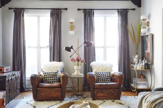
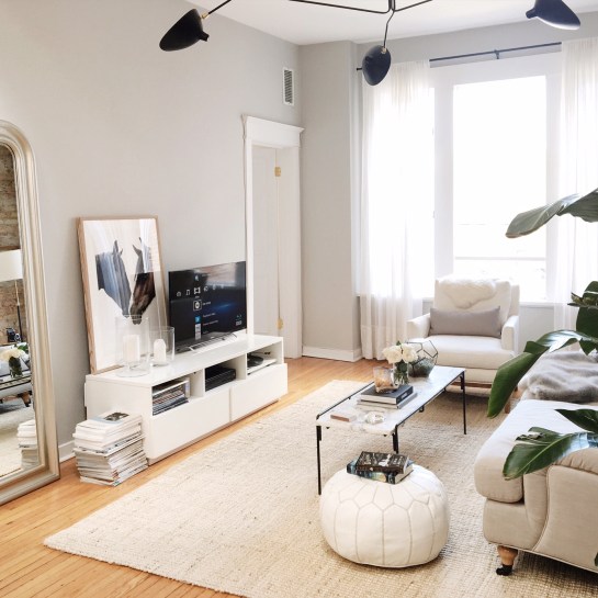
word on the street was that stonington gray was a “true” gray. not too blue, not too brown, not too yellow. just plain gray. exhibit A, below.
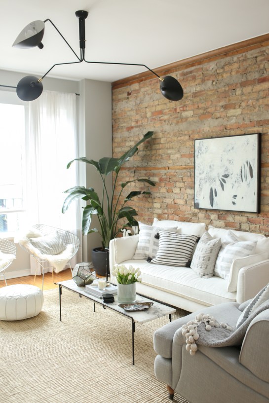
i also knew that one of my overall inspiration shots (from danielle moss’ amazing scandinavian- esque chicago place) heavily featured the color.
so good, right?
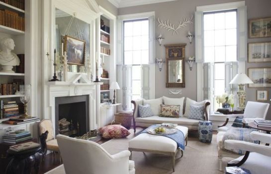
SO GOOD. except for the fact that there was a small part of me that wanted to go bright white, EVERYWHERE, a la amber lewis (exhibits A and B, below).
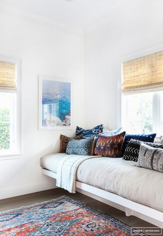

AH, BRIGHTNESS. LIGHT. SERENITY. HAPPINESS.
to say i was torn is a very strong understatement.
so i did the only thing i knew how to do: i asked someone who knew better than i did.
that someone? a VERY helpful saleswoman at the janovic paint store conveniently located just down the street from my office.
i’ll admit, i was a little bit overwhelmed by the sheer amount of options at janovic (and this was only the benjamin moore line!). so i was thrilled when a very nice looking woman meandered over to me and asked me if i needed some help.
“actually, you know, i do! i’m, uh, i just bought this apartment and i’m renovating it and i need to pick paint colors ASAP and i thought i wanted gray but i also kind of want white, because i want it to feel light and bright but there are SO many whites to choose from, and i heard stonington gray is nice but i’m not sure if it’s too dark…”
did i mention i ramble when i’m nervous?
luckily, this woman knew her shit. she told me to sit tight, and she’d pull some samples. she came back with a few options: stonington gray (which she agreed would indeed be a good gray for me), along with decorator’s white (for the bedroom walls, kitchen and bathroom–basically everything that wasn’t the living room and entryway), and simply white for the trim (a little bit brighter made sense for trim/molding/door frames).
she waited patiently while i showed her photos of my recently discovered exposed brick, and happily grabbed additional grays and whites for me to look at before i choose two colors to make into sample pots. she explained that stonington gray would be beautiful against the exposed brick, and that it was light enough that i could carry it into the bathroom if i so chose. she also told me that while “bright white” was certainly a thing i could achieve, i had to be careful—too white and things could get “a little bit institutional” up in here.
NO THANKS. THAT SOUNDS LIKE THE OPPOSITE OF WHAT I WANT.
so, stonington gray it was (is).
it’s rather hard to tell in the image above, but it’s the color swatch on the left, and it’s what i plan to go for in the living room (front wall, back/windowed wall, and entryway). the rest of the apartment will be “decorator’s white” – a white that has just the faintest of undertones (aka, a true white white without seeming institutional). the goal? to have a white that doesn’t make the cabinets or tile look dingy (and vice versa). will it work? WE SHALL SEE.
both the living room and bedroom have been primed, so paint will go up in the next two weeks! EEEK! stay tuned for progress shots!
