Archive

before pictures

hi, friends. wow, two posts in one week?!  i don’t even recognize myself. is this what i look like when i have a project to write about? i’m like a changed woman over here. {editor’s note: i started this post on july 16th. it’s now august 1st. OOPS}

just kidding. {editor’s note: CLEARLY}

but only kind of – i really do feel like this project has gotten my creative juices flowing again. i hate that phrase, but it’s true. my day job got really crazy for about 6 months straight (though it’s been way more chill the last few months! advertising ebbs and flows), and i think working pretty much all the time just kind of zapped my energy. i never wanted to bring my laptop home, let alone open it to write or design or do any of the fun creative things i generally like to do.

now that things have calmed down (and more importantly, now that i have a project to focus on!), i feel like my brain has switched back on. there’s all sorts of stuff whirring around in there, but lest i freak you out, i’ll only share some of it. in particular, we’ll start with the bedroom design plan, which, if you’ll recall from my previous post, is currently sitting unused, because allie got uninspired and couldn’t seem to figure out how to make the room work for her.

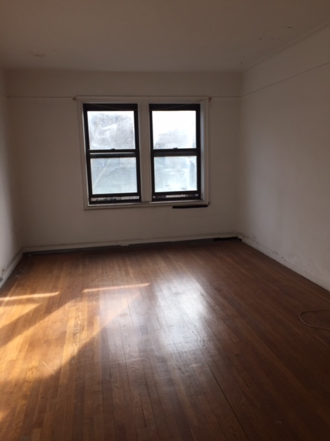
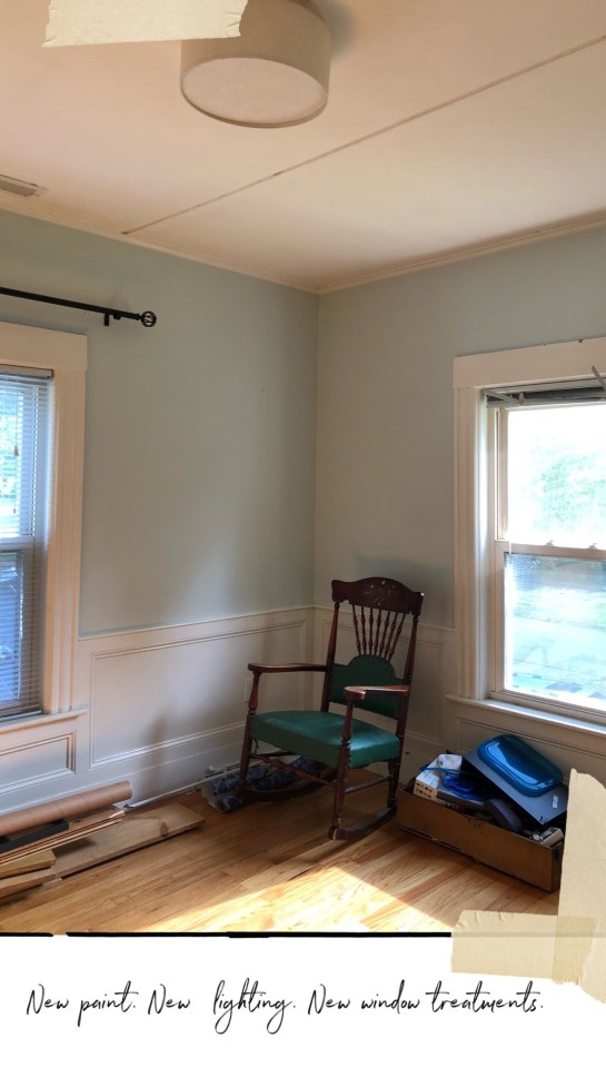
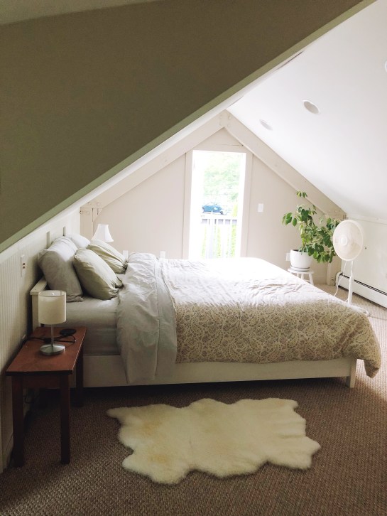
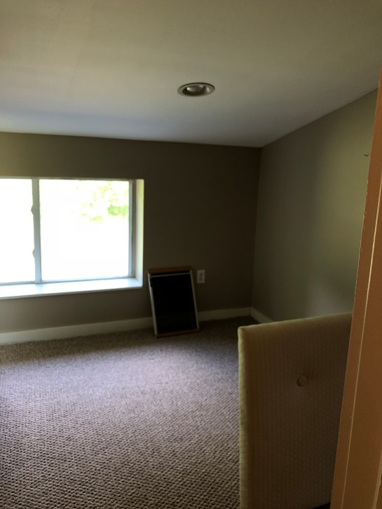
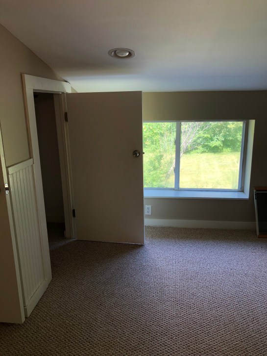
right now, it looks like this:

IMG_7457
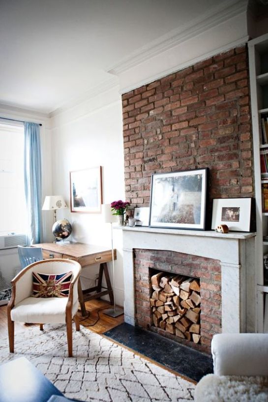
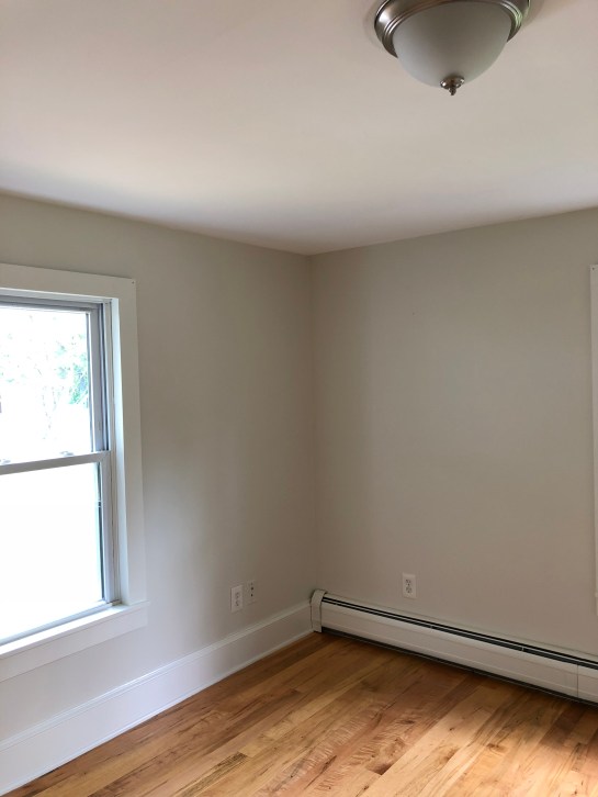
a blank canvas of sorts, just BEGGING to be repainted and freshened up a bit. i love the wainscoting in here, and i think once we soften things up a bit (we’re going very neutral in the space), this room will feel crisp, calm, and happy. which is generally how bedrooms should feel, if you ask me. i’m all for bright colors, and fun prints, and i love how moody bedrooms look when i see them on the internet, but when it comes down to it, i just want the place i sleep to feel a bit like stepping into a cloud. allie’s mind moves a mile a minute, and i’m hoping to give her a space that helps her slow down (even just a little bit).

IMG_7459

so, without further adieu, here’s the plan. like i said above, we’re going deep into neutral territory. we’re switzerland, in a design board. this is more neutral than any space of mine, but with the amount of light allie’s bedroom gets, i think it’ll be beautiful.

Allie's House_Bedroom1

while i was home over july 4th, we went to the paint store and picked up sample pints of the two colors above (both benjamin moore, my main man). you’ll notice i’m proposing that we go lighter on the walls, darker on the trim. this is the opposite of what’s traditionally done, but it’s a trend i’ve been seeing a lot of lately (i’m particularly smitten with jenni yolo’s barnhouse paint choices and this kitchen from amber interiors, while not exactly the same, they show the concept has legs!). i’ve saved a bunch of inspiration shots of this look on instagram, and i’m thrilled that i was able to convince allie (and my parents, whose opinion means a lot to us!) that it’s the right way to go.

side note: does anyone else call places the “xyz store”? my friends at work recently made fun of me, HARD, for saying i was going to “the food store” after work (ie, the grocery store). i’ve just now realized this is a thing i do with lots of things. paint store, food store, drug store, etc. AM I THE ONLY ONE?!

IMG_7586 (1)

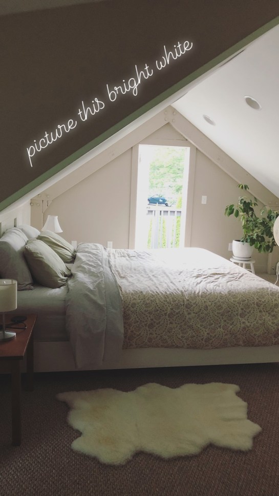
we started by putting the two paints up on the wall, just to see how they look next to one another. i didn’t want to go painting the wainscoting if we hated one of the colors on the wall. i’ve asked allie to take photos of the swatches at various times of day, so that we can see how it looks in the daytime vs. the nighttime. so far, we’re pretty sold. i can’t wait to see how fresh this space feels with some bright white on the walls.

the freshly painted walls will serve as the perfect crisp, clean backdrop for the other pieces we’re bringing in, while the brass accents in the lighting and curtain rods will help keep the space from reading too cold (which is often a risk when you go all white + neutrals).

IMG_7585 (1)

so, let’s break it down a bit, shall we? allie hasn’t had a ton of thoughts on what she likes, design-wise, but she did have a few requests when it came to the actual pieces in the room.Allie's House_Bedroom1

  1. a bed with a headboard. this is a relatively easy fix, because allie already has a box spring, mattress, and metal bed frame. a brand new bed + mattress would blow our budget, but a new headboard (the kind that attaches to a metal bed frame) is totally doable. we’re going for a simple linen option: pretty, but also comfy enough to rest her head on/sit up against.
  2. better lighting. when we moved allie into this apartment, we skimped on lighting. there’s an overhead fixture in her room right now, but it only has a single bulb, and doesn’t give off much light. the new option above will offer ALL THE LIGHT while still looking verrrry cute (if i do say so myself). we’ll also be adding bedside/reading lights (either in the form of plug in sconces, or small table lamps).
  3. more storage. as discussed in the previous post, we’ll be building out some simple shelving in allie’s closet (there are two in this room!), but we’ll also be getting smart about storage elsewhere. nightstands with drawers offer a place to shove all your inevitable bedside clutter, while pretty baskets serve as a resting place for extra blankets, shoes, etc.
  4. a full length mirror. i love the option above (from urban outfitters) because it not only provides a mirror, but also offers some hanging options. allie can pick out her clothes for the next day, or hang delicates to dry on the right side, and admire her fabulous self on the left.

in addition to those four things, we’ll be purchasing a new rug (would you believe the one above is MACHINE WASHABLE?!), new bedding (simple striped jersey from target), and new art (from my favorites over at juniper print shop). then, if the budget allows (i’m working my magic to make it so!), we’ll also splurge on an accent bench (i love the pattern of the textile on this one, and it’s a great extra seating spot in a small space), a pretty clothes hamper (so the laundry doesn’t end up on the floor), and the cutest dog bed i ever did see for her cockapoo, daisy.

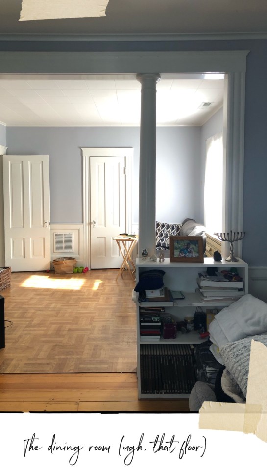
i’m sure that as we start painting, ordering things, and of course, assembling them and getting them in the space, this plan will change a bit – but right now, i’m feeling pretty darn happy with how it’s coming together. the living room and dining room are presenting a bit of a challenge for me (odd angles, columns, different flooring, less natural light) but this room…this room,  i can see.

IMG_8254

me, early on in my renovation at the grand apartment

you guys ready for a real #tbt? here’s a little video i took, on my iphone, way back in the summer of 2016, when i closed on my little apartment on grand street. it’s the before tour of all before tours (at least, around these parts). i was just diving into the blogging world, i’d just started my instagram, and i was feeling a wee bit overwhelmed by the immensity of the project i’d taken on with exactly zero renovation experience.

cut to three years later, and i’m itching to do it again. luckily, my sister has asked me to help her redecorate (no, not renovate, at least, not anytime soon!) her apartment, giving me a new project to focus on, and a whole new set of “before” photos to share with you!

if you follow me on instagram, you may have seen these the other day – but i’m re-sharing them here so that i can talk you through them in a bit more detail. in the upcoming weeks, i’ll be sharing full design plans, but design plans are nothing without a little background, am i right?

let’s dive in, shall we? below, we’re standing in the kitchen, looking into the bedroom. this unit is on the top floor of an old house (built in the 1900s, i believe) that was turned into a two family home many years ago. because of this, the house has both good bones (the wainscoting in the bedroom!) and some very weird design decisions (the ceiling tile! the weird kitchen layout!). i’ll get into more detail on our budget later, but it’s a redesign/decorating budget, not a renovation one. if we have some money left over, we may do some small upgrades in the kitchen (flooring – bye linoleum!, lighting), but for now, most of it is staying as is.

IMG_7457

so, the bedroom! it’s my favorite room, to be honest. that wainscoting really gets me. when allie first moved in, she was really into blues and greens, so we painted this room a pretty seafoam green. over time, her tastes have changed, and so we’ll be taking the bedroom in a more neutral direction. it’s amazing what a fresh coat of paint can do, and we’ll be moving in the white/off white direction.

you may have noticed that there’s not really any furniture in the bedroom as of now. that’s because allie couldn’t seem to make it work, layout-wise, and instead of calling her older and wiser sister 😉 she decided to call it quits and move EVERYTHING into the living room. more on that in a minute, but suffice it to say, this room needs help. luckily for us, the fact that it’s empty means we can a) paint it ahead of time and b) store all our furniture deliveries in here ahead of install day.

IMG_7459we’ll need to patch the window frames before we add a fresh coat of paint throughout (we’ve already got the colors picked out, and allie is planning on throwing some samples up on the walls to make sure we’re headed in the right direction). we’ll also be getting rid of these curtain rods, and hanging the new ones much higher up (something 2013 sarah did not know!). new lighting will a) modernize the space and b) make more of a statement and c) light the room better (more bulbs = more light!).

IMG_7461this room has a cute set of double closets (if we were doing real construction, i’d knock down this wall to make the room larger and let the light in, but such is life!), but they need a bit of work.

IMG_7458

we’ll start with a fresh coat of paint, and then we’re planning on building out some simple shelving in here, so that allie can actually fold and stack her clothes (right now, they’re crammed into too-small vintage dressers). if i can find someone local and cheap enough (like a friend’s handy husband!), i may actually sketch out something beyond just 3 shelves, but that’s our starting point, at least for now. the bar will come down, as the second closet has plenty of hanging space.

IMG_7462
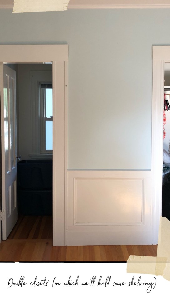
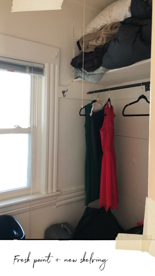
here’s the second closet. in here, we’ll remove the front bar (allie dresses super casually, and doesn’t have a ton of stuff to hang), and find better shoe storage. i’m thinking a back of the door shoe organizer might work best, so that we can free up the space inside the closet itself. she’s in the process of sorting through the bags below – all of which are clothes she potentially no longer needs/wants – to figure out what can be donated. if anyone has any amazingly bright ideas for what to do in here, please let me know! i’m going to be looking around for good DIY closet ideas over the next few weeks.

IMG_7460i’ve also (happily) talked her into getting rid of these blinds. if she wants blinds, we’ll do bamboo ones (like i have in my kitchen), but the plan is for simple sheer white curtains in here, to let the sun shine in. it’s the little things, folks!

ok, moving on. right now, as you’ll see below, allie is using her living room as her bedroom, her dining room as her living room…things are a wee bit weird! for as long as i can remember, she’s liked crowding as much stuff as possible into her spaces, and this space is no exception. our task here is to help allie figure out what she needs in her space, functionally, and then what will make her happy, figuratively.

we painted this space a pretty grey tone when she first moved in, and we’re still pretty happy with it. for both time and budget reasons, i think we’ll leave the paint as is (though i’d love to be able to give everything a fresh coat of bright white, i’m not sure it’s in the cards right now. TBD on that front!).

this space will get, at minimum, new lighting, new window treatments, all new furniture, a new layout, new rug, and new art. so, basically everything but the paint color will change. and if i magically zoom through painting the bedroom in early august, i might just tackle this area too 🙂 i will say this paint color tends to photograph rather dark (i didn’t edit any of these photos, in hopes that they’d be true to life!); in person, it reads a much lighter.

IMG_7464

we’ll start by clearing everything out, and putting the bedroom back where it belongs. one thing that became immediately clear to me during my most recent walkthrough was how much allie needs better storage. this apartment has only 3 closets (but a lot of usable attic space, and a basement!). there are the two in the bedroom, and then there’s one in the dining room. the door you see above leads out into the hallway – but allie never uses that as an entry to the apartment (there’s another door from that same hallway into the kitchen, and she generally enters that way, or through the outside second floor porch (which also leads into the kitchen). that said, if i can make it work within the layout, my goal is to not block this door, just in case she ever changes her mind!

to the right of where she’s got her bed is her desk area. allie works in IT, and is a big computer person (lucky for us, she’s like having the geek squad on demand!). right now, she has two ikea desks creating an L shape for her workspace, but my goal is to figure out how to simplify it down to one. then, we’ll add drawer storage (via filing cabinets from CB2 ), and create a corkboard wall (like this!) for her to pin up art, inspiration, important notes, calendars, etc.

IMG_7452

see that cool looking vintage camera and globe above? those belonged to my grandma and grandpa. i told allie to hang onto them – they’ll make great styling tools when the time comes! above you can also see a mini bookshelf. allie has two of these in her apartment, and while there’s nothing WRONG with them, i want something a little sleeker, and more importantly, taller. when in doubt, follow the manhattan model: build up. we’ll actually be utilizing one of the dining room walls (where the yellow dresser is below) for a big bookshelf.

IMG_7463

the living room and dining room are, ostensibly, one larger, interconnected space, and i’m designing them as such (which you’ll see when i share design boards for this space). oddly, the owners covered up the beautiful wide plank hardwoods with yucky parquet at some point (but only in the dining room!). we don’t have the budget to rip these out and refinish what’s below, so for now, we’ll put a big rug in this space to try and distract from the ugly flooring.

IMG_7454

here’s another view of the dining room, which allie’s currently using as her living room (her couch and GINORMOUS TV are in here). a few of you commented on those ceilings in stories, and while i too wish they could go, that’s more of a renovation situation than a redecorating one. my hope is to make the rest of the space sing, and just let the ceiling tiles blend into the background. work with what you’ve got, and all that.

one thing i do love about this space is those columns. are they a little intense? sure. allie hates them and wants them gone. but i think with a fresh coat of (less shiny!) paint, fresh design, and better art on the walls, we can make this room beautiful. the door you see straight ahead in the photo above is one of the aforementioned closets, and it’s where allie stores things like air purifiers, fans, vacuums, etc. to the left is the door to the kitchen. right now, there’s absolutely zero shelving in there, too. i’d love to get some hooks to mount some of the items above (and things like brooms), and free up the floor space for some baskets or bins (to store things like games, office supplies, etc.).

IMG_7456

this photo is snapped from the kitchen. the closest door is to the left. this space exemplifies what i talked about in yesterday’s post: a mishmash of what was cheap, or what was comfortable, or what was available – but no real design. i’m THRILLED to say we found budget for a new couch, so this one will be getting donated. and goodbye, TV tables, i shall not miss you. we’ll patch the holes above, raise the (new!) curtain rods, and get brand new curtains (window changes will happen throughout the entire space). this room doesn’t have an overhead light, and since we don’t want to tear down the ceiling, my plan is to get a hanging plug-in pendant, and run it up the wall and over the ceiling, then dangle it down, centered over the dining table.

ok, folks – that’s the gist of it! questions? thoughts? brilliant ideas? i’m all ears.

ACS_1278 2

hello, friends! god, is this thing still on? long gone are the days of me promising to write here more, as i tend to get my kicks on instagram. but sometimes, there are stories that just don’t fit inside the grid. and those stories require resurrecting this here blog.

if you’re here, that means you’ve likely seen me talking about my new project over on the ‘gram. it’s my sister’s apartment (that’s her up at the top of this post!), and she’s been kind enough to let me have my way with it.

that sounds naughty, doesn’t it? what i mean by that is, she’s basically given me free reign to redecorate it. she’ll be weighing in on design decisions, of course, but she’s effectively a dream client in that she trusts me and my taste implicitly. before we dive into exciting things like design plans and budgets; shopping lists and mood boards, i wanted to tell you a bit about the apartment itself, and the situation allie has found herself in. because i think it’s a situation MANY of us find ourselves in in our mid-twenties (and beyond!).

quick sidebar, though: i want to preface this story by saying that i know design is a luxury, and that while you can certainly do it on a budget (which we will be!), it does, most of the time, take money. we’re privileged to have a bit of that to work with (more on our budget in upcoming posts, but it’s not huge!). i feel lucky to have the opportunity to give my sister a space she will love (and she deserves!), and i recognize that we’re lucky to be in the position to do so.

okay, now back to the story. 

recently, while i was in mexico with a few girlfriends, my sister and two of her friends came to stay at my apartment here in new york. while allie is quite familiar with my renovation (she is my sister, after all), this was the first time she’d gotten to “live” in the space for a few days without me or my parents around.

when she got back home to massachusetts, she mentioned to me that being in my home – one that feels finished and thoughtful and homey (i’m paraphrasing here) – made her realize just how much she didn’t like being in hers. i’ll pause to let that break your heart just a tiny bit like it did mine.

IMG_7454

see, home means different things to different people. some people don’t care what their home looks like, so long as it’s comfortable. some don’t care about trends or quote unquote “nice things.” many don’t have the privilege or the luxury to care about either. but what i think it means for almost everyone is a safe haven – a place where you open the door, and you exhale, and you know that for just a moment, all is right in the world, and you are safe.

is good design inextricably tied to that feeling? of course not. but i tend to think it doesn’t hurt.

and right now, allie’s home is missing that.

IMG_7464she’s found herself in a position that many people find themselves in post-college. her apartment is a mishmash of hand me downs, things she got on sale, things she (and i, with less design knowledge than i have now!) picked out years ago that now feel “young” and unsophisticated. nothing quite goes together, nothing quite fits, because there was no real thought put into the overall look of things (and in some cases, very little thought put into individual items). i say this not as an insult to her or any of the assorted family members to whom some of the items originally belonged – this is the way most of us furnish our first apartments!

sometimes i think about the first place i had after college: the futon in the living room that passed as a couch, the folding TV tables that we used as “coffee tables” (and more accurately, places to put our vodka sodas while we pregamed on the weekends), the “bed” i crafted from a mattress atop plastic drawers from the container store (storage!). YOU GUYS, I HAVE COME SO FAR.

and now, it’s time for allie to do the same. to have her “grown up” apartment. and i’m so excited to be helping her create it. over the next few months, i’ll be sharing the process – hopefully finishing with a week in late august in which we unbox and install and style ALL THE THINGS.

in between now and then, here’s what you can expect to see:

  • before photos
  • FAQs (feel free to leave any questions in the comments here!)
  • inspiration images
  • design boards for the bedroom, and living/dining room
  • shopping lists/budgets for each space
  • paint choices and colors
  • sneak peeks on instagram

come back tomorrow for the before tour. i can’t wait to bring you guys along for the ride!


ACS_0702.JPG
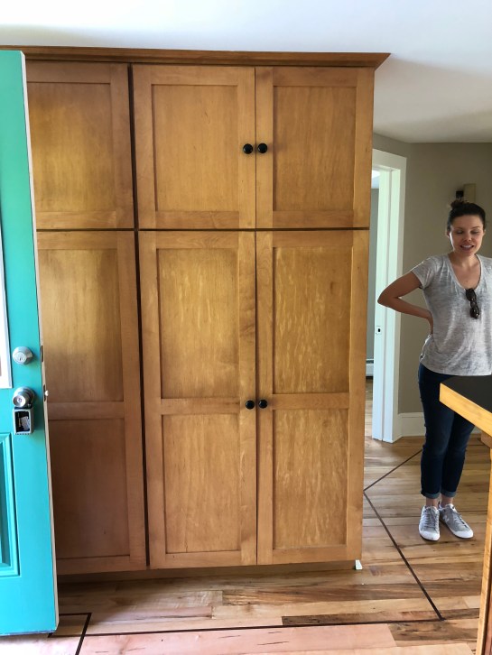
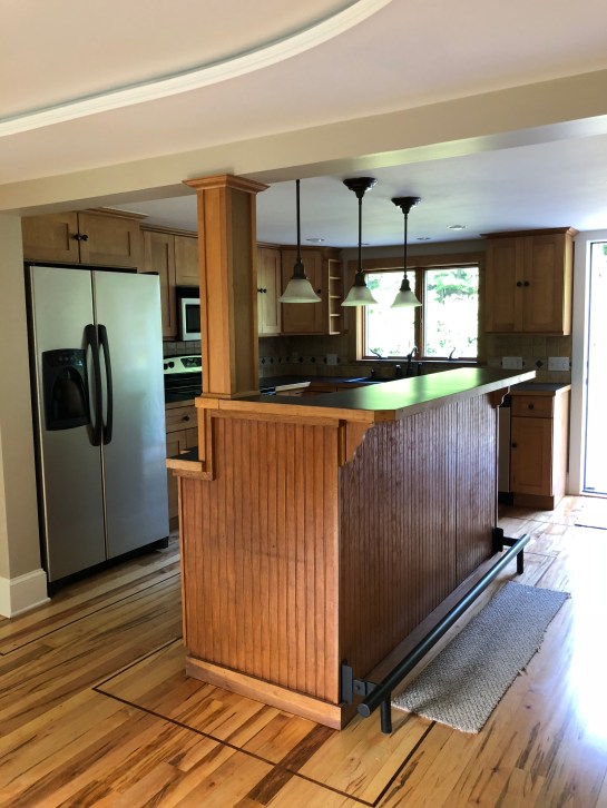
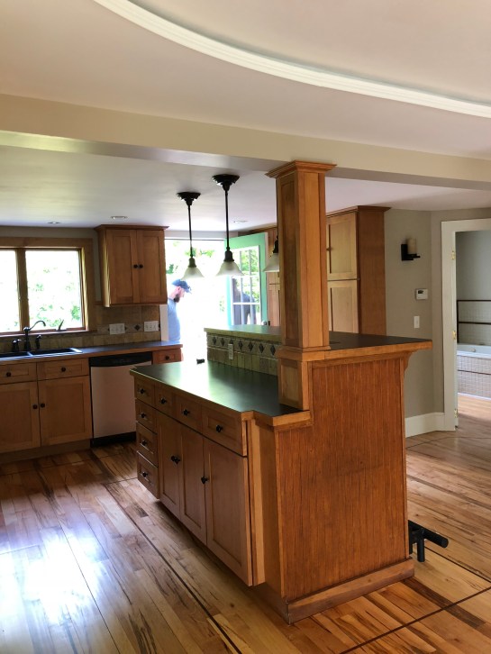
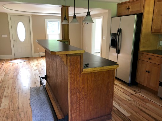
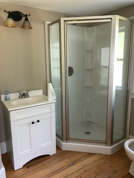
did you guys catch the latest on my bff’s house on instagram this weekend? i was home in massachusetts for the holiday, and went over there for dinner sunday night. joia and T are officially moved in, and while they still have lots of updates to make, the house is already starting to feel like a home.

my favorite room in the home is their bedroom (pictured above). it’s oddly shaped, and has pitched ceilings, which makes the layout a bit tough to master, but it’s got so much potential. when i first saw the house (sans furniture), i immediately pictured this room whitewashed, like this.

all-white-bedroom-beneath-the-vaulted-ceiling

or this.

gorgeous-villa-in-the-village-of-vastra-ingelstad

i know it’s not exactly the same, but use your imagination for a minute here. stare at the photo below, and imagine all the walls that are currently beige painted a crisp, cool white. then pictured simple, matching side tables (like these), and lighting (like these). for bedding, i’d love to see them go a little crazy with this gorgeous, ocean-themed set from rebecca atwood. joia’s dream is to have a house by the ocean, and until she gets that, this room can serve as her seaside oasis.

IMG_1489

like the photoshop rendering below, where i’ve faked the white walls.

Garner Master_White Walls

doesn’t it INSTANTLY feel lighter and brighter?! the carpet in here is new, so chance are, they’ll keep it for now (though chances are good that there are beautiful hardwoods beneath!), but joia placed an ikea sheepskin on the side of the bed, which i think is a great solve in the interim. they have lots they want to do, design-wise, to the rest of the house, and in that sense, this room is the closest to “done.” the only big update needed in here is paint (which will likely happen in the spring at this point, unless i come home for a weekend and go rogue). everything else is simple updates: nightstands, lighting, bedding, etc. all things that can wait.

Garner Master Bedroom_Design Plan_v1.jpgthoughts? comments?! can you see it?! i can.

more on the garner cape house:

the living room design plan

my best friend bought a house! (part 1)

my best friend bought a house! (part 2)


life is funny. the weekend before this one, i published a post about how my best friend bought a house (!). in it, i shared that joia (said house-buying bff) and i had, along with our other bff kim, been friends for 30 years. and now, as i write this post, i’m sitting in kim’s living room in san francisco (i’m here visiting her and her husband G for the long weekend). despite the three of us living across the country from one another (me in NY, joia in MA, kim in SF), we manage to find time and ways to see one another multiple times a year. the flight to SF is just long enough that it’s a bit of a pain for a long weekend, but i always find it to be worth it.

ACS_0608

kim, my moms, and me at the ferry building in SF

plus, my parents were here for the last two days, which made the trip extra special: i was able to spend friday with them before the three of us met up with kim and G for dinner, and they met kim and i for a post-soul cycle walk around the ferry building farmer’s market before going off on their own yesterday.

ANYWHO. back to regularly scheduled programming! we’re gathered here today so “walk through” the second floor of joia and T’s house, which is a 1940s cape house brimming with potential. if you need a refresher on overall thoughts on the house, check out this post. it contains all the details about the first floor, and paves the way for the living room design plan i’ll be sharing later this week.

below is the living room. i’m standing in the staircase that leads upstairs. this room is rather large, and leads up a cute little set up wooden steps with a circular window at the landing and a bigger window on the staircase itself.

Garner Cape_Living Room Wide Shot 2

here’s joia standing in the staircase. you can see a glimpse of the tiny little round window on the landing below, and this window is set towards the top of the staircase. it looks out onto the leafy green backyard, and lets in a lot of nice natural light.

IMG_8782

i actually quite like the style of the railing – it fits the house. the stairs are in great shape, and don’t need a runner–but i think one would look nice here, and would feel nicer underfoot.

at the top of the stairs, you’re given a few options: the master bedroom, which is a low-ceiling, attic-esque room with an odd layout but lots of space, and the second bedroom/”kid’s room” that has AMAZING original built-ins.

let’s start with the master. this is what you see when you stand in the doorway of the room. straight ahead is where the bed will go (on the right wall). the doorway at the right leads to a bathroom. the doorway straight ahead leads to a small (tiny) deck and side staircase. they’ll fix that spot eventually, but for now, we’ll probably just find a cute area rug to cover the linoleum area.

Garner Cape_Attic Master from Hallway
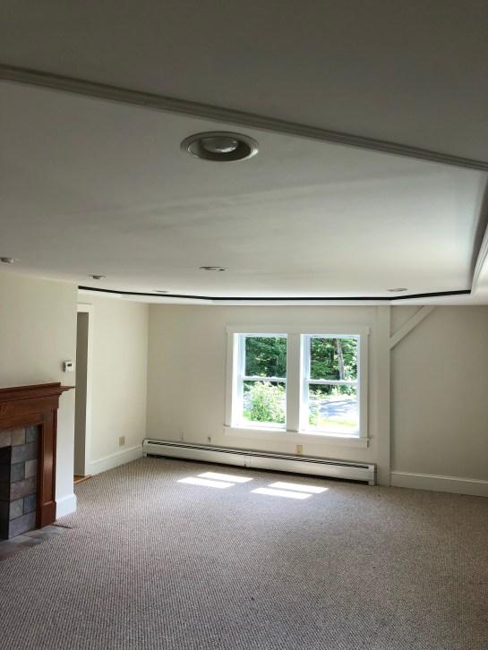
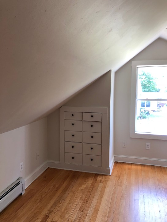
this carpet is new, and can be found throughout the house. while it’s not necessarily what joia and T would have chosen, it’s nice underfoot, and they can add area rugs to make it look cuter. you can see that the roofline of the house is such that this room is almost like an attic space (they actually have insane storage to the left in the photo above–it extends all the way into the eaves of the house). i’m recommending they whitewash it all: walls, ceilings, trim. i think in a room like this, white and bright is the way to go. i have MANY ideas for this space, but that’s a post for another day.

Garner Cape_Attic Master_Full
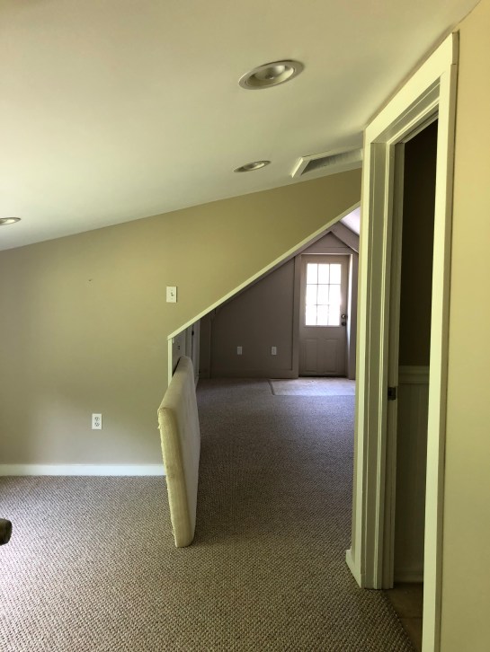
above is the room from another angle. can’t you picture it all white and bright? maybe with some white sheepskin rugs at either side of the bed? they’ll have to cut down their current bedframe to fit in this space, but they can make it work. as we were walking through the space, joia and i noticed there was an abundance of light switches and outlets (see the back wall above); she’s hoping T or an electrician can get rid of some of them/put the in spots that make a bit more sense.

Garner Cape_Attic Master_Front Wall
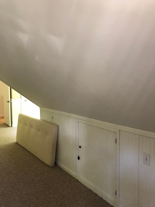
here’s the storage area i was referencing above (i’m now standing at the back wall, where the bed will go). behind this door is tons of open space – perfect for suitcases, extra boxes, out of season clothes, etc.

off to the right below (aka to the right of where joia is walking out of frame) is an open area that they’ll be able to use for storage (a dresser, probably), along with a large closet (you can see the door peeking out in the photo below).

Garner Cape_Attic Master into Hallway

we’re thinking of a dresser along the slanted wall below (again, picture this all a bright white). and then, setting this spot up for joia to do her yoga and meditation. with the big windows and some beautiful candles and crystals i think it’ll be positively lovely.

IMG_7134

here’s this side of the room from another angle. at left is the closest, straight ahead will be joia’s yoga area. the closet is quite deep, so once they really do it up in there (aka, add some more shelving/rods), it’ll be a great storage space.

IMG_2086

now on to the second bedroom. this is where it gets really good. sadly i didn’t take as many pictures of this space as i should have – i’ll have to get some more from joia. for now, this will be a second bedroom; in the future, it could easily be turned into a kid’s room. i think we’ll swap those sconces out, but how much do you love those built-ins?! they’re original to the house, and i love them so much.

Garner Cape_Kids Bedroom_Built Ins 2

that window area is positively begging for a built-in window seat: bench with cushion, and maybe some storage below?! picture it filled with baskets, or brimming with children’s books. heart melt.

Garner Cape_Kids Bedroom Built Ins

the floors in here are particularly lovely, which gives me faith that the same floors are under the rugs in the rest of the house (especially in the bedroom), should joia and T want to tear up the rugs later on in life. my parents had wall to wall carpeting throughout our entire upstairs when i was little, and slowly, over the years, they tore all of it up for hardwood flooring. the room i now stay in when i come home is actually the only remaining carpeted room! it sounds crazy, but it’s definitely something you can do over time/later on, especially if you don’t have the budget to do it when you first purchase your home.

SO. that’s all for now. i’ll try and snap more pictures the next time i visit, and of course, will keep you updated, whether it’s here or on stories, on the progress. coming up this week: the living room design plan.

more on the garner cape house:

my best friend bought a house (part 1)!


as some of you may remember, when i was home in late june, i got to do something extra specially fun: i got to see my best friend joia’s new house! those who have been following me for a while may recall that two of my closest friends are also two of the oldest: i met them in preschool. yes, pre-school! there we are below over christmas break. joia is on the left, i’m in the middle, and kim is on the right.

IMG_5725

we’re all spread across the country now–me in new york, joia in our hometown (she bunked with me in new york for a year, but ultimately moved home to be with her now husband!), and kim in san francisco–but we see each other as often as we can. because we’ve been friends for so long, we’re more like sisters than anything. we’re what my high school psychology teacher liked to call “refrigerator friends”: the people who can walk into your kitchen and open the fridge and take what they like, the people for whom your home is theirs, and vice versa.

ACS_0060

L-R: our friends kara and sophie, then joia, and me.

so you can imagine that their sadness is my sadness, and their joy is my joy. which is why i was positively OVERJOYED when i heard that joia and her husband were house-hunting. sure, it’s fun to decorate an apartment in NYC but it’s even MORE FUN to decorate an ENTIRE HOUSE. joia and her husband, who i’ll call T, recently purchased an adorable little cape home on a street located (happily) about a 4 minute drive from my parents. the house has a big back yard (they’re planning on building a great deck and a garden!) and is across from a bubbling brook; if you listen carefully, you can hear the water from their front steps. it was recently “renovated” but in flipper style, which means that some (read: most) of the finishes aren’t exactly what joia would have liked them to be–but it has a lot of potential!

joia and T didn’t want to take on a full gut job (they both work full time and it would’ve been nearly impossible, not to mention a big financial strain), but they’re happy to work on their new home little by little to take those not so great builder finishes from drab to fab. T happens to be very handy, so they’ll be able to do a lot of the work themselves.

i know joia is a bit disappointed that the home wasn’t instantly all she ever dreamed of, but let’s be honest: few homes are. i think this is the case with a lot of first-time homeowners, especially those that don’t have endless budgets (which i think is MOST PEOPLE). you start house-hunting and you think of all the “must haves” (aka, things you’d like to have). and then you realize what your actual budget can get you, and you learn to compromise, and to live with the fact that dream homes don’t happen overnight.

the bottom line is this: even if your home starts in a yucky place (i mean hello, look at what mine used to look like!), you can get it to a happy one. and that, my friends, is where i come in! joia and t don’t have an endless budget (who does), so they’ll likely be decorating little by little, over time–but i’m going to be helping her think through her design choices as they happen, and i CANNOT WAIT. like i said, when do you ever get to help with a WHOLE HOUSE?!

so, let’s look at the before pictures, shall we?! i snapped these in early june, right before joia and T moved their furniture in. i’ve got a lot of big plans in my brain for the house, starting with the living room (which i’ll share here next week!), but let’s start at the very beginning (a very good place to start).

read on for an ONSLAUGHT of photos!

first up: the kitchen. when you enter the house through the back/side door (where you’ll pretty much always enter), you see the kitchen straight ahead, and behind it, a large eat-in dining area. the appliances were recently updated, and while joia isn’t in love with the cabinets, they’re solid maple, so the plan is to work with them for now. she found some nice inspiration images that show this style and shade of wood cabinets with a pretty, light sage green paint, and is contemplating going that route, as a full kitchen reno isn’t in their future anytime soon.

Garner Cape_Kitchen Island 2

the kitchen island–we’ll likely paint it, and remove that weird foot bar.

joia might kill me for the photo below, but it’s the only one i got of the (VERY SPACIOUS!) pantry. god bless non-city storage space, amiright?! here, you can also see a very weird inlay detail in the floors. joia HATES this, but short of ripping up or re-staining all the wood floors, there’s no way around it. this is why god invented area rugs. behind her is a downstairs bath (with soaking tub! odd choice but hey, a tub is a tub!) and off to the right, a small bedroom that T will use for his office (he works from home a few days a week).

Garner Cape_Kitchen Pantry

here’s a better shot of the kitchen. i for one am really excited to take this on as a design challenge, as i think this kitchen is PRETTY CLOSE to a lot of suburban kitchens out there: microwave over the stove, mid-range stainless steel appliances, oak (or maple) cabinets, odd  mediterranean-esque beige backsplash tile…there’s lots to not love, but also, lots of potential for not a lot of dough. more to come on the kitchen plan later, but my first recommendation here will be to rip out the backsplash and replace it with classic white subway tile. if i have my druthers, i’ll also have them redo the counters, but that’s likely a project that can’t be done right away.

Garner Cape_Maple Kitchen Cabinets

kitchen cabinets and appliances

here’s the kitchen as seen from the large dining area. we’re not in love with what’s going on with that weird ceiling treatment (the living room has it too; we think it hides the electrical for the recessed lighting), but like i said above, such is life with a first home. you can’t win ’em all!

Garner Cape_Kitchen Island

i’d like to help them select new schoolhouse-style pendants for over the kitchen island, and again, i’m going to advocate that they paint that baby (maybe a deeper green or a simple, clean white?). here you can see that the weird backsplash goes all the way around. but there’s LOTS of good here: new appliances, a sink that overlooks a window into the dreamy backyard, good light, loooots of storage, and plenty of counter space.

here’s the dining area. i’m picturing a nice round pedestal table here, maybe with white windsor chairs? and perhaps wiring in a chandelier to draw the eye up. obviously, the odd sconces will likely go.

Garner Cape_Kitchen into Dining Area

Garner Cape_Kitchen Hallway

more weird sconces. bye bye, sconces.

the above photo gives you a better sense of the layout (i’m standing in the dining area) in terms of front door/pantry/island, etc. it’s really quite spacious for a relatively small house (i think it’s around 1500-1700 square feet).

from here, you can also get a sneak peek into the tub in the downstairs bath–with soaking tub (more pictures if you scroll down!).

Garner Cape_Kitchen from LR

here’s the full view of the eating area. the placement of the front door will limit them a bit in terms of table size, but it’s larger than it looks. i’m also thinking that some nice built-in bench seating could work with a more oval table, but i need to get in there and measure out the space. i know T could build benches in a hot second, and then we’d just need to get some cushions made to cozy it up a bit. i can see it!

Garner Cape_Kitchen from Front Door

eating area, as seen from the kitchen. they’re getting a new front door.

Garner Cape_Kitchen Eating Area

see what i mean? plenty of space!

Garner Cape_Eat In Kitchen

insert cute dining nook here

okay, moving on. this is the downstairs bathroom, which, oddly, has both a stand up shower and a soaking tub. it’s a spacious room, and someday, when joia and T have budget, they can really make this space shine, but in the interim, it’ll likely be cosmetic fixes to make it work for them right now.

Garner Cape_Downstairs Bathroom

obviously, this space needs a mirror, and new lighting would be ideal.

here’s where it gets a bit strange. soaking tub: yay! weird beige tile + red wood: NAY. some odd choices were clearly made in this room, so for now, joia’s plan is to paint the wood strips below white, and just make the best of it. a soaking tub is a soaking tub, no matter what it looks like.

Garner Cape_Downstairs Bath_2opposite the entrance to the bathroom is a third bedroom that’s actually quite a nice size. it has two windows—one that overlooks the driveway/side of house, and one that looks out on the front yard. in the back of the room is this large closet, which joia and T are going to build out with lots of useful shelving. hooray for storage space! someday, they’ll get doors made, but for now, they may just find some cute curtains to hide what’s behind.

Garner Cape_Downstairs BR Closet
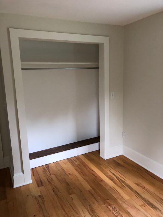
below is the front of the room. that boob light has to go, but that’s an easy fix. this room has really nice hardwoods, great light, and will make the perfect office for T on his work from home days.

Garner Cape_Downstairs Bedroom Front Window

Garner Cape_Downstairs BR

here’s where T will put his ginormous L-shaped desk. this window looks out on the driveway.

okay, now for the fun part: the living room. the living room has the same odd ceiling situation as the dining area, which joia and T will replace someday, but not right away. so for now, it’s about drawing the eyes up via high-hung curtains, and making the space feel at once light and airy, and homey and cozy. i’ll be sharing a full design plan for the living room (at least, my dream design plan!) next week, but let’s talk about the basics.

the photo below was snapped in the living room, looking into the eating area. so, through that door is where i’d love to put the little L-shaped bench/table situation.

Garner Cape_LR_Front Right Corner
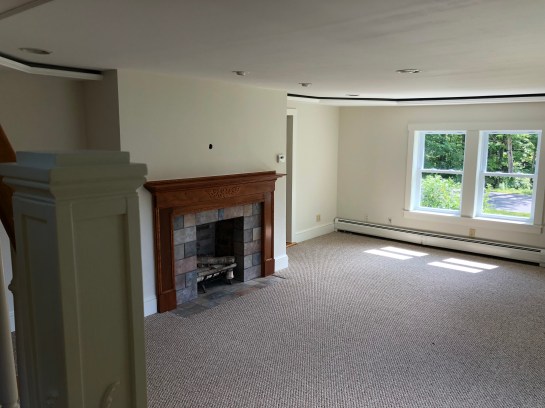
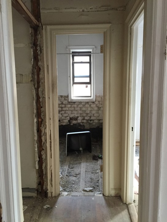
the area below is getting the biggest facelift, because that, folks, is a faux fireplace. as of today, it’s already been torn out and covered up with drywall (more to come on that next week with the living room design plan), with room left in the middle for built-in shelving to store TV consoles, cable boxes and the like. above it, joia and T plan to mount the TV (T has to watch his sports, joia has to watch her friends reruns).

Garner Cape_LR_Fireplace
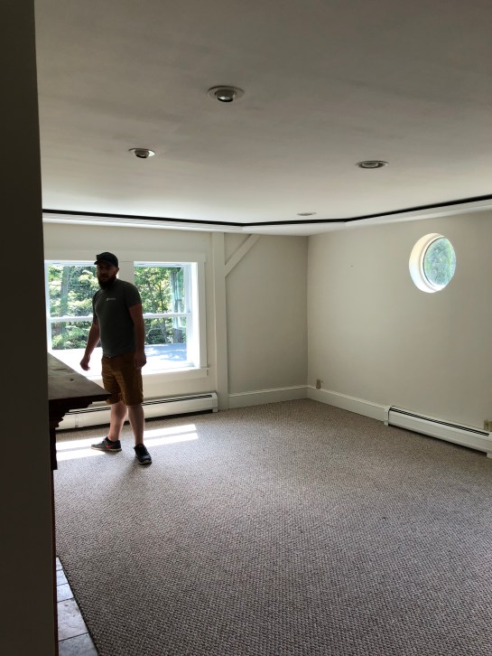
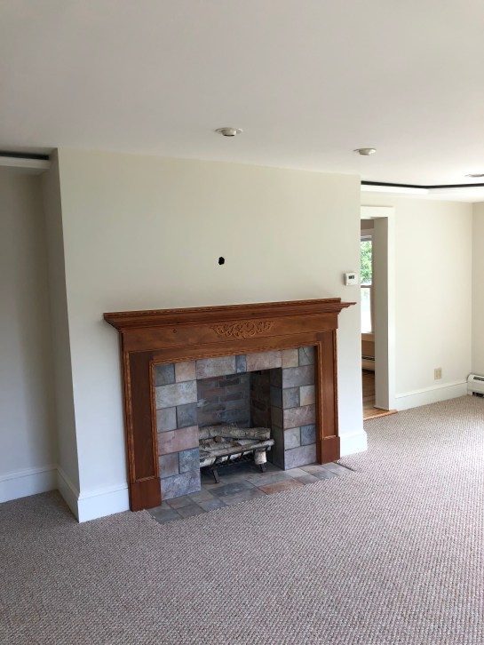
here’s the back right corner of the living room, otherwise known as sectional city. that’s right, there’s a giiiiiant sectional going right here. it’s unclear what the homeowners were thinking with the little round window, but we’ll chalk it up to 1940s charm.

Garner Cape_Living Room_Sectional Area

hey, it’s T!

Garner Cape_Living Room Wide Shot 2

the light in this room is truly lovely–and the space is BIG.

Garner Cape_Living Room from Stairs

here’s the (almost) full room snapped from the stairs. picture that fireplace gonzo and you can really see how the space will come together.

ok, friends, that’s all for now. i’m saving the upstairs for the next post, mostly because i’ve typed 2300 words and i can’t imagine any of you have even made it this far. i don’t want you keeling over at the keyboard. or myself, for that matter.

anywho, if you were one of the lucky/wonderful few to make it to the end, i’d love if you’d weigh in with any questions/comments/thoughts, and even better, if you’d tell me whether you’d be interested in hearing/seeing more about the design process as it unfolds!

this is a real life home, a real life, budget-friendly process, and i think it’ll be cool to chronicle how regular folk design their homes (without endless budget and endless time).  i’m so thrilled to be helping them pick stuff out (even if my design boards don’t come to fruition for years!), and i hope you’re thrilled to come along for the ride.


img_9557

so, remember like 3 months ago, when i stupidly thought i could “get ahead of the game” and start thinking about floor stains? SILLY, SILLY SARAH. if i could go back in time and warn 3 months ago sarah that basically NOTHING would go as planned and that there is really no way to get that far ahead of ANY of this…

well, let’s just say i would.

anywho. in case you missed the post above (clicky clicky, friends!), 3 months ago sarah thought it was as simple as choosing between “light” and “dark” – HAHA. SILLY, SILLY SARAH! TIS NOT THAT SIMPLE, GIRLFRIEND. turns out that, just like paint colors, floor stains come in basically every shade under the sun…AND YOU CAN MIX THEM. which means that there are essentially ENDLESS possibilities.

my floor guy, lou of finishing touch floors, told me that my first step was to take a look at the minwax website and get a feel for the colors. he thought i might be interested in a shade known as “special walnut” (teehee). so over i went to minwax, where i found this very helpful (read: not helpful at all) graphic.

cc9e01b7f985684d398733aa34239dc0

do you see special walnut up there, number 224? it looks OH SO REGULAR, right? REG CITY. so i turned to my friends google and pinterest, to see what they could show me about special walnut.

761c6891ab687ea26448b87eb058fc2c

….pretty regular. so i decided to hunt around on pinterest to see what others liked. as it turned out, special walnut was, surprisingly, pretty popular (#bland, america). people also had quite a thing for english chestnut, weathered oak, and early american.

so i asked lou if we could see a few (read: a bunch) of samples. and on tuesday morning, that’s just what we did.

img_9546

lou’s worker, eric, sanding down the floor for stain tests.

img_9549

amazing how much dirt/stain/grime/life comes off with 5 minutes of sanding, isn’t it? i couldn’t believe how beautiful the hardwoods were in their original oak form. imagining this room being built way back in the 1920s gave me all the feels.

once the floor was sanded, lou wiped it down with water and let it dry, creating a spotless surface for us to work with.

img_9555

here he is opening all the various stains and prepping them in little plastic cups.

img_9560

and here they are all laid out. i immediately ruled out the far right and the third from right – too dark. second from right is special walnut, which, not surprisingly, looked REGULAR, just plain old REGULAR brown, on my floors. the middle dark one is “english chestnut” – pretty, but a little too red/dark for my liking. second from the left is “early american” – meant to make your floors look, well, early american. which mine are.

img_9558

here’s a closer look. so, on the far right, we have a dark brown (i forget the color, apologies!) mixed with weathered gray. on the far left, we have the same mixture, but two parts gray to one part brown. far right might have worked if i wanted to go dark; far left felt drab. second from left is (ding ding ding!) the winner, early american. next to it is english chestnut, which read waaaaayyy too red on my floors (they’re oak, by the way, for those wondering). next to english chestnut was special walnut, looking as drab and brown as they come. apparently, this color really sings on some floors, but on mine, it was like that guy that auditions for the voice and is so horrifically bad that you wonder how he made it past initial casting, let alone got in front of blake and adam.

so, what happens next? after i left, the guys got to work, patching the part of the floor that had been ruined when we took down the wall between the entryway and the kitchen.

IMG_8145

remember when the living room/entryway looked like this?!

the “newer” looking floors you see below are, well, brand new. and magically, just as he promised, lou managed to match them to the old ones. he’s warned me that once stained, the new planks won’t be exactly like the old, because the new wood will take the stain differently than the old floors will, but to me, things look pretty damn good.

img_9578

for reference, i am standing at the very front of the living room; to my left is the dining area, to my right is the breakfast bar (where those cabinets are)

today, lou and his guys are sanding and staining, and by friday night, i’ll have shiny, fresh, beautiful floors. EEK!

just for funsies, let’s take a look at where the living room was when construction started…

grandapt_before_LR

pictured at closing – doesn’t it look so much smaller without the brick wall exposed?

and where it is now, with the brick wall exposed, the lighting up, the front wall painted, and the floors ready for stain.

img_9577

kind of crazy, right? i have a feeling things are about to get GOOD.

b0640fe19f01a12c2f35f9120a8f77cc

photo: danielle moss’ chicago apartment 

when i first started searching for apartments, my broker asked me to make a list of the things i wanted. i told him i was sick of living in a 1960s style box with zero charm. i was OH SO OVER fugly parquet floors (helllooo, 1950s) and walls that went straight up to the ceiling with nary a piece of molding in site.

i wanted CHARM CITY, and i wanted it ALL: original hardwoods, crown molding, clawfoot tub…and the real kicker: exposed brick. a true symbol of old new york, of the lives that came before ours.

of course, no one gets it all. not usually, at least. and as of about a month ago, i certainly didn’t. i’d gotten the hardwoods (in relatively good condition, and definitely salvageable in both the bedroom and the living room; the entryway remains up in the air), the molding (you can fake it, just like highlights), and the tub (thank you, clawfoot tub gods!). but the brick was a no go.

as a reminder, here’s what the living room looked like when i bought the grand apartment.

grandapt_before_LR3 copy

here’s what it looked like in the beginning of the demo phase (dated picture rail off the walls, new electrical in the process of being run throughout).

new york city apartment renovation

nothing to see here, right? just some white plaster that was sorely in need of a refresh.

but then. BUT THEN. one morning, before i left for a 10 day trip out west, i stopped in to talk to my contractor about what was to happen while i was away. and through a tiny little rectangle of wall that was being cut out to make room for new outlets, i saw something red peeking out.

i bet you can guess what comes next…

“wait a second…is that BRICK?!” 

“oh, yeah, probably.”

(he leans down to take a closer look)

“yes, that’s brick.”

“does that mean it’s BEHIND THAT ENTIRE WALL?!?!”

“probably, yes. do you want us to find out?”

UM, HELLO! DO YOU EVEN HAVE TO ASK?

DO I WANT YOU TO FIND OUT? HELLS YES, I DO.

let me remind you of my dream:

11beff1c0cb61fdfa13f12cbf193b588

i nodded eagerly, and told him that if there was brick underneath that whole wall, i wanted it exposed. ALL OF IT.

and then i left, and did a little happy dance in the elevator.

a few days later, i got this:

img_8688

by the time i got home from my trip, they’d made quite a bit of progress.

img_8837

img_8854

img_8852

cut to last week, and an entire wall of plaster had been painstakingly scraped off. my exposed brick wall was free, in all its glory!

it’s a bit surprising, actually, considering that this isn’t an exterior wall (the exterior of the building is indeed brick, but all the other interior walls we’ve torn into are old wood/plaster situations). it’s a wall that’s shared with the apartment directly beside mine.

as you can see below, there are old electrical boxes in the wall – likely where the original tenants had sconces – which means that a) this brick was original to the apartment and b) at some point, someone CHOSE to cover it up.

img_9066

why anyone would consciously say to themselves, gee, i’m going to cover this beautiful brick with plain old PLASTER is beyond me…but that’s all in the past, because i have discovered it, and i plan to restore it to its former glory.

the goal is to sand the wall down and seal it, just so it’s not casting dust everywhere. i’m also hoping i can rip out the old fixtures you see above, as they jut pretty far out of the wall. beyond that, i’m keeping it simple: one or two larger art pieces behind the couch (which will go on this back wall), and a large round mirror behind the dining area (to the right of this photo).

since we’re still about a month or so out from decorating, here’s a little eye candy to tide you over. YAY BRICK!

cde8e9b99192ee24b032ebf51e00fa6a

d240eb11be4c87621bf7f8f3b9aed0d7
static1-squarespace


img_8917

throughout this entire process, i have waited for the moment where things start to feel real. the moment where a construction zone starts to feel like some semblance of a home. and earlier this week, that moment happened.

my kitchen cabinets were delivered late last week, and my contractor promised that friday or monday, they’d start putting them up. true to form, after meeting him at the apartment on friday morning and reconfirming the layout, they got to work. and by early afternoon, i’d received photos of the cabinets in progress. EXCITING, right?!

i’ll be completely honest: when my contractor told me “had a guy” who “did cabinets” i was a little bit skeptical. that skepticism only grew when i found out the guy worked out of the back of an ACE hardware store in DEEP brooklyn (literally, i took the 2 train all the way to the end of the line). after exiting at nostrand and walking a few blocks past a target and an applebee’s, i came across a defunct meat market advertising “just killed!” chickens.

i almost turned around. surely, i was lost. signs ahead pointed to brooklyn college, but there was barely a soul on the street.

img_8945

then i walked one more block, and saw a (small) sign for ace hardware. i stopped, and stared at the chain link fence surrounding the store.

this must be the place, i thought to myself. the place where i get swallowed up into some freaky alternate back in time universe where they kill chickens right in front of you and then ask you if you need semi gloss or eggshell.

there was a small parking lot out front; an old nissan altima was parked diagonally across two spots. beyond that, two double doors opened into a quiet neighborhood hardware store with no kitchen cabinets in sight.

i’d been told to ask for “chew” — but the woman at the checkout desk simply stared blankly back at me when i said his name.

“yo! is there a CHOO that works here?” she called out to the orthodox man working the paint counter in the back, payis dangling down from his hat.

“back here,” he motioned to me. “come back this way.”

suddenly, from the very back of the store, a small man poked his head around a doorway.

“hi sarah!”

img_8914

chew! he did exist! in the back of this weird orthodox hardware store in deep brooklyn was an asian man who sold kitchen cabinets.

i spent the next hour with chew going over the type of cabinets i wanted (white shaker), ruminating over what size pantry i needed (18″ would suffice, anything larger was overkill), and discussing the pros and cons of soft-close drawers (i hate them, chew said they were standard these days).

at 7pm, ace hardware closed; by 6:55, i was out the door, waving goodbye to chew, who had, in the past 55 minutes, become my friend. chew understood the look i was going for (“you like the farmhouse style! but not TOO farmhouse!”). he knew i liked to bake and therefore needed space for my cookie sheets (“we’ll give you roll out drawers, two big ones, so they can stack! it’s too heavy otherwise!”). he’d agreed to customize a 16″ deep double cabinet for my island (“you need room for the legs!”), and to figure out a way to make the giant farm sink i wanted from ikea fit (“don’t you worry, sarah, we’ll make it work.”)

img_8925

chew was a god among men. a god hidden in the back room of a hardware store in a strange no man’s land between midwood and flatbush.

he was, in other words, exactly the kind of smart, creative, small business kind of guy i hoped i’d be working with when i decided to pinch my pennies and go with the lowest contractor quote i’d received.

i’d budgeted $8k for my cabinets; shmulik had told me that depending on what i wanted, they’d come in between 6 and 8k. a few days after i met with chew, i received a layout, along with a quote: $7370–almost $600 below my max budget, with wiggle room for any additional filler pieces i might need last minute.

would i have loved to be closer to $6? of course. but i also wanted a pantry, and a small breakfast bar, and the two rollout drawers chew had got me all excited about. so i forked over a 50% deposit, and a few weeks later, a giant load of boxes arrived at the grand apartment.

a few days after that, the boxes were unpacked, and the cabinets went up on the wall.

and just like that, i had “the moment” – the one where i saw a home coming together right in front of my very eyes.


IMG_8254

welcome to the disaster zone!

yesterday, while “editing” this video (and by that i mean lightening it ever so slightly), it occurred to me that if i really want to do this right, i should hire someone to film a few video shorts of the process. NOT try to do it myself. because as the video below evidences, i am a SHITTY videographer. and my iphone is NOT up to the task. keep your eyes peeled for upcoming videos–which hopefully will be prettier than what’s below–but in the meantime, in the absence of anything better, i thought i’d show you where we stand.

for those who prefer photos over crappy iphone footage, here are a few more in-progress shots. these were taken last friday; this week, they’ll start prepping the electrical work, then sheetrock over the walls to make things flat and pretty, and maybe even lay down the kitchen tile (!!!!). stay tuned, friends, because it’s ABOUT TO GET GOOD.

new york city apartment renovation

standing in the entryway | looking into the living room

NYC apartment renovation

kitchen to the right | that sewage pipe will be turned into a seemingly purposeful pillar, and the breakfast bar will go directly to the right of it

nyc kitchen renovation

kitchen scariness | back wall will house the fridge, upper and lower cabinets, and a pantry

NYC apartment renovation

living room into hallway | bedroom to the right, bathroom to the left

nyc apartment bathroom renovation

staring into the bathroom | floor will be penny tile, walls will be white subway