
meanwhile, in tile heaven…
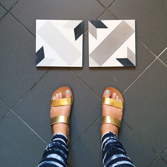
on the left: the tile i wanted | on the right: a very close second
as you may have seen on instagram (hii, are you following @_thegrandapt yet?), i am having a BIT of a tile dilemma. #champaaagggneeeproblems
the tile i so desperately wanted after seeing it in kate arends’ kitchen is out of stock. til october. no can do, folks.* this unfortunate news means it’s time for plan B. i have two choices: to go with a tile that is practically identical, but slightly darker (and a little more in the taupe family of greys), or to go back to the drawing board completely. i am REALLY not into going back to the drawing board, mostly because i am oh so ready to get this show on the road, but also because i really do love the “star” pattern i had already picked out. it’s a statement without smacking you in the face. it’s moroccan-inspired but not overly so. it’s not cheap, but it’s also not ludicrously expensive. it’s practically perfect in every way!
so, what’s a girl to do? visit a tile store, and more importantly, talk to someone who really knows their shit.
enter: chelsea arts tile + stone, and specifically, alison, the owner. i heard about CATS (i mean, has there ever been a store with an acronym more suited to me?! I THINK NOT!) through a friend of mine, nika, who i met in GREECE of all places.
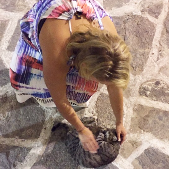
me petting a street kitten approximately 30 seconds before we met nika and peter
nika and i met on the cobblestone streets of paros, one of the greek islands, last september. my friend sara and i were strolling along shortly after our ferry had docked, and i was busy petting every (and i mean EVERY) cat in sight. down the street, we heard the familiar sounds of the english language, and sure enough, soon two friendly folks ambled around the corner. those folks were nika and her friend peter, and they were all, “HI! YOU SPEAK ENGLISH?! WE SPEAK ENGLISH!” and we were all, “WHERE ARE YOU GUYS FROM?!” and they were all, “TORONTO!” we became fast friends, and ended up inviting peter and nika to spend a night with us in santorini.
when nika saw on instagram that i’d purchased the grand apartment and was on the hunt for tile, she reached out and was like:
“yo. you HAVE to contact my best friend alison. she runs the only female-owned tile shop in NYC and she’s the bomb.”
to which i said something along the lines of, OH HELL YES. female owned? #girlboss #girlpower #allthefeministhashtags
at the time, i already had my eyes on the cement tile shop’s “star” pattern–so i didn’t really need a fancy tile shop. but then things fell through, and i decided to reach out to alison, and see if she could offer a little guidance.
as it turns out, she not only had guidance, she had my tile. in a sliiiightly different colorway.
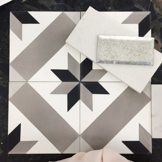
the pattern i wanted, in a taupe-ier grey, paired with marble-look quartz countertops and amazing mirrored glass tile.
alison kindly set up not just one tile, but four, so i could see the full scope of the design and the coloring. and contrary to what all my instagram friends had said (thank you all for your thoughts!), she felt that it would NOT be that much darker overall than the colorway i had originally wanted. in addition, she showed me what it would look like paired with the marble-look countertop i’m planning on getting, so that i could see how the grey would play off the slightly warmer quartz sample.
and you know what? i like it! in fact, i don’t just like it. i might even love it! am i sad that my original choice is out of stock? sure. but i trust alison’s vision, and i think she makes a good point when she says that a) i’m going all white everywhere else, and b) my reclaimed wood will need a little warmth to play off of (which this darker colorway gives me).

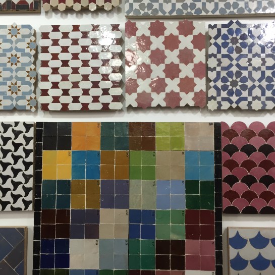
alison’s shop was CHOCK FULL (and i mean, to the brim) of amazing tile. that you see above? it’s sourced straight from a factory in morocco. if i had a spanish style home in los angeles, i would be ALL OVER that blue and white situation on the top right.
she also showed me other options for cement tile–but most of them felt either too french cafe, too modern, or too busy moroccan. in my gut, i feel like the “star” pattern i’ve picked out is perfect in its simplicity. it’s graphic, but not overly so, it feels fresh, but not scarily modern, and it’s got a hint of global flair without feeling full on fez.
so: here’s the consensus. i’m sleeping on it, but more than likely, i’ll plan to order the “star” tile in the darker colorway seen above. it’s in stock, alison can get it easily from the warehouse in new jersey to the curb outside of the grand apartment, AND it looks fabulous with the countertop i’ve already decided upon.
WIN WIN, folks.
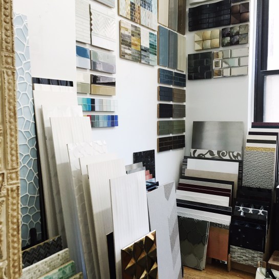
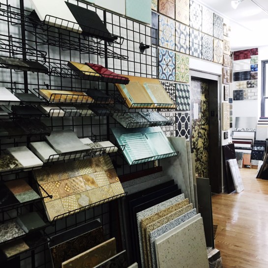
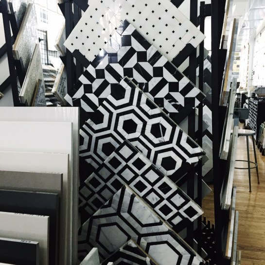
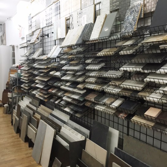
want to see some more pretty? check out a few snaps from the CATS showroom, and stay tuned next week to see a post on bathroom tile, and whether i’m leaning marble hex or simple penny.
*watch me smack myself upside the head when october rolls around, and i’m still in early construction phase, and i tooootallly could have waited til october!
