Archive

inspiration photos

eskayel office

see that gorgeousness above? it’s a shot of the eskayel office, a brooklyn-based company (right down the street from the famous peter luger steakhouse!) that creates the coolest, prettiest, most badass wallpapers, pillows, rugs, etc. i’ve ever seen.

i’ve waffled back and forth over the past few weeks as to what i want this apartment to be. call it “defining my design style” which is a stupid, silly term that resolutely proves that i watch WAY too much HGTV.

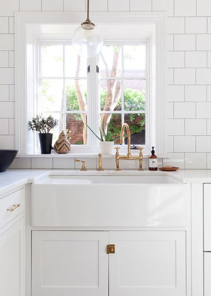
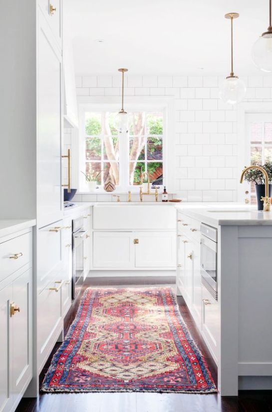
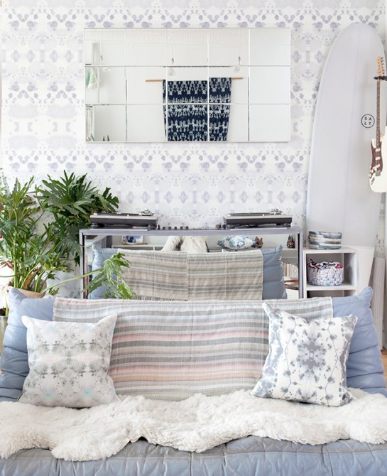
the world today, and especially, the internet today, is so over saturated with beautiful interiors that it’s hard to separate the “wow i love this” spaces from the “i want that to be MY home” spaces. i go back and forth between wanting california cool, a la amber lewis and chic neutrals, a la danielle moss. i have a feeling i’ll end up somewhere in between, with a space that’s grounded in neutrals, but accentuated by colorful textiles and art. and also, by this eskayel wallpaper, which i have been pining after since i saw it featured in taylor tomasi hill’s chelsea apartment years ago (see below).

eee36a66d75a2bc33382da131df6a40d

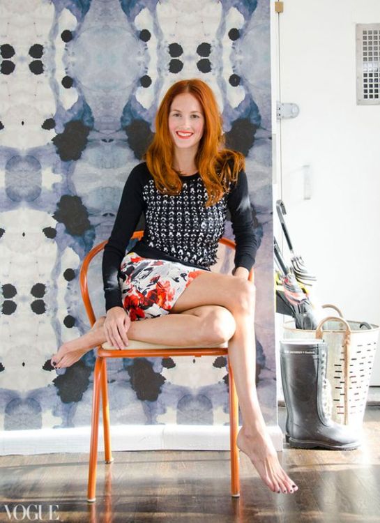
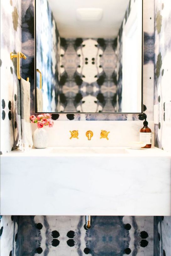
how BEAUTIFUL is that? it’s the sort of design detail that makes people stop and stare, that turns your apartment from a ho hum home into a kickass interior inspiration palace. eskayel founder and designer shanan campanaro takes familiar elements of nature – the sky, the ocean – and turns them into incredibly dreamy digitalized designs that almost look like oversized tie dye.

7da8d4cf1ef0dd29cd2c6893a9b46603

i did some googling, and found this great interview she did with abc home a while back. it’s worth a read. i am so envious of the makers in this world – the true creatives. rebecca atwood is another amazing textile artist that i’ve been following for a few years (i was lucky to snag a few of her pillows at her spring sample sale, and felt instantly cooler as soon as i walked out of the studio space).

13c12e9be3ee91a54c4ae4729e9e3517

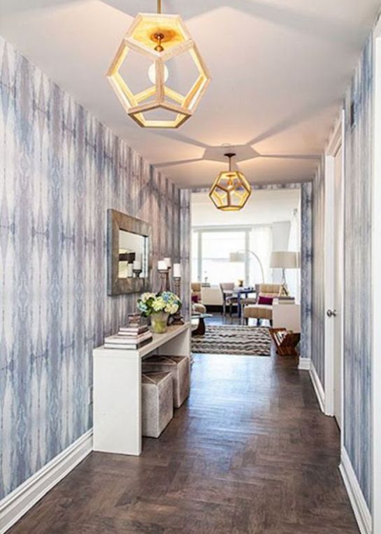
eskayel’s wallpaper isn’t cheap (and rightfully so), so if i want to incorporate it at all, it’ll have to be in a small space. many of the inspiration shots i found used the paper in bathrooms, and powder rooms, specifically (wallpaper in bathrooms with showers/tubs = recipe for disaster, thanks to heat and steam), but i’m leaning towards an entryway sort of thing – just a little pop when you come through the front door. the photo below is a good example, though it’s obviously MUCH bigger than my space.

2ea49d3dbf29d95ae9840a193f78bb64

discerning eyes will notice this is the same paper TTH used in her apartment – it’s called dynasty. so amazing, no? more eskayel goodness below.

7da8d4cf1ef0dd29cd2c6893a9b46603

3a70dd130dbc2b2ee743fda29bc70e45

57516e03c0affd8e303b01f2f9635852

6131c8d5f8afbfdb94b3ec21254c775b


83cae163-9940-40b9-9fca-851730b7df2f--the-intern-house

the holy grail of kitchens, which belongs to alison cayne of haven’s kitchen.

recently, i read a post on food52 that proclaimed that subway tile was soo over. the market was over saturated, the blog posts overdone, pinterest ready to explode and vomit subway tile all over everyone and everything. and in typical new homeowner fashion, i felt a slight chill creep up my back. was i about to make the biggest mistake of my life?

was i about to use a tile that was soooo over in my kitchen?! 

i’ve been reading interior design blogs, and buying interior design books (shoutout to my two faves, erin gates and emily henderson!) for YEARS, now. like, almost a decade. and if there’s anything i’ve learned from them, anything can be trendy, and any trend can be overdone. but not everything can be a classic. and a classic, well, it never goes out of style.

today, riding the 6 train uptown, we stopped at 23rd street, and i meandered toward the exit, eying the walls in front of me. they were, of course, my beloved white subway tile. and as i looked at them, i thought to myself, screw you, food52.* subway tile is a CLASSIC. it CAN’T ever be over!

and then i went back to pinteresting the hell out of subway tiled kitchens. here are a few i’m using as inspiration for my own.

home-tour-michelle-adams-in-michigan

this kitchen belongs to michelle adams, formerly of domino. adams recently bought and renovated an adorable little house in michigan (you can follow along on her instagram account). her kitchen is the perfect example of classic done right: hardwood floors, stainless steel appliances, marble counters, white cabinets, and white subway tile backsplash.

marvelous-in-michigan

another look at adams’ kitchen. i’d like to do some open shelving, but i think i’ll go natural wood instead of white to warm things up a bit.

kitchen-reveal

you know, like this.

photo-1

or this.

lekker-eten-in-de-mooiste-keukens

or this (sans children, for now, of course).

photo

this pantry gives me heart palpitations (the good kind).

oil-rubbed-bronze-with-cobalt-dome-shade

white grout or black grout? HELP ME DECIDE, tile gods.

5046931369

this looks more like light gray grout. a compromise! i love everything about this, and i already have mostly white dishes, so i could make this happen.

Sink+In

hiii, farmhouse sink. i love you. those brass accents ain’t too shabby either.

cabin-progress-open-shelves

small but mighty. i will thankfully have a good deal more space than this –  but it’s proof that if i need to go budget and try butcher block countertops, it won’t be the end of the world.

colonial-home-tour

can you imagine coming home to this beauty every night? who wants to pack me into a suitcase and take me to morocco so i can bring home ALL THE AMAZING RUGS?!

so. what say you? subway tiles: yay or nay?

*food52, i actually adore you, and respect your opinion greatly.