Archive

design plan

unnamed-1

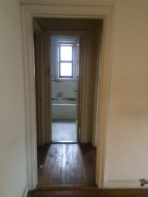
lots of work to be done here. hence, the need for an architect.

when i first started this process, i figured i’d have to deal with an asshole or two. this is new york, this process is complicated, the industry is filled (mostly) with me. assholes were bound to be a part of the puzzle.

still, i hoped to be wrong. and for the initial six months, i was. my broker, eric, is nothing short of an angel. my lawyer andy thinks i’m the most obnoxious person ever placed on this earth, but he has yet to yell at me. and doug, the mortgage broker eric referred me to, is a man with a never-ending supply of patience. he has answered approximately 5,000 questions, assured me that i’m capable and smart, and promised me that not only will he not let me fall flat on my face, he’ll see me through all the way to closing.

those are the good men. but the bad ones–well, let’s just say they’ve made me question my faith in dudes. one of these bad ones is an “architect” (quotes are necessary, i will explain why in a bit) we’ll call B. B was referred to me by my contractor, Shmulik, who has, thus far, also placed himself firmly in the “wonderful and helpful and very much not an asshole” category.

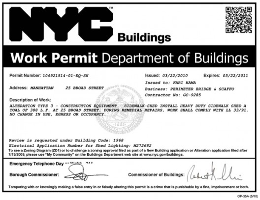
but let’s back up a bit. why, you might be wondering, do i even need an architect? that’s a good question. it’s one i had myself. turns out, when you want to renovate an apartment in new york city, you can’t just bust down walls and go all peter paul and mary “if i had a hammmmmmmer” on this bitch. quite the opposite, actually. first, you have to get approval from the management company in charge of your building, and by virtue, their engineer and architect. then, once management has approved, they can (and usually, will) dictate that your plans are submitted to (and approved by) the new york city department of buildings. you know those permits you see pasted on the windows of construction zones? if you want to renovate your teeny little totally not important to anyone apartment, you’ll need some of the babies below.

6a00e551f492f988340147e3b9c1e9970b-pi.jpg

and guess what? you can’t do any of that on your own. first, you have to hire an architect, who will draw up the plans for renovation, and help you prepare what you need to submit to the management company. then, you’ll also need an expeditor, a person whose sole purpose is to go down to the DOB and wait on line for you, moving your shit along so that you don’t have to wait 6-8 weeks for DOB approval. your expeditor usually comes from your architect, as does an asbestos inspector (also needed for DOB approval).

{for more on this process, see this nytimes article – which nearly gave me a heart attack}

in short, an architect is pretty important. you can’t do it without them. so it’s important you find one that you a) like, and b) can do the job and do it right.

now that we’ve got the basics covered, back to B. B was, i was told, a guy who could draw up the plans and help me submit to the board. he was fast, and he was cheap. those two things alone should have been a giant flaring WARNING WARNING symbol to me, but as a girl who knows she likes pretty things, anywhere i can save money and reallocate it to, say, a lighting fixture, i’m inclined to do so.

i first spoke to him on a friday morning. he was the epitome of a fast talking new yorker, a guy that seemed determined to “educate” me on the phone about all i didn’t know. i wanted to work with him, so i kept my mouth shut when he talked down to me like a stupid child who didn’t know her ass from her elbow. he said he had plans of my unit in his files, and he’d send me something by the afternoon.

the afternoon rolled around, and guess what? nothing came. he’d asked me to email him some info; i’d done it first thing. no response to the email either. i waited until monday to follow up, at which point he made an excuse about being busy and said i’d have it first thing tuesday.

by friday, i still didn’t have anything. that was week 1. the same thing happened in week 2. i’d follow up, he’d promise to get the plans to me, i’d receive nothing. by memorial day, i was fed up. so when i got him on the phone that morning, two weeks after his initial promise to get something out to me same day, i told him if he couldn’t get it to me when he said he was going to, i would find someone who could.

i meant it to come out as a firm but respectful missive. just because i was a woman didn’t mean he could walk all over me. i might be new to this process, but i know when i’m being jerked around.

to say that B did not respond well to being threatened is an understatement. he inhaled deeply, and then said, practically vibrating with anger, “GIVE THE JOB TO SOMEONE ELSE. I DO NOT WANT IT.”

and then he hung up on me. HUNG UP ON ME! what is this, kindergarten?! the only person who ever hangs up on me is my mother, and she’s allowed because, well, you know, she birthed and raised me.

i was so shocked that i literally stood on the street with my phone in my hand, staring at the screen, wondering if that had actually just happened. i waited a few minutes for him to call back and apologize. he did not. so i called my contractor, and told him that if he didn’t mind, i’d need another recommendation for an architect.

lucky for me, he had another name. to read part 2 (and to see the renovation plans!), come back tomorrow. 

designplan_kitchen

reclaimed wood shelving (i’ll be shopping big reuse for mine) | brass breakfast bar pendants | mod flushmount lighting | white subway tile | silestone countertops | encaustic floor tile | white shaker cabinets (getting these through my contractor, yay!) | black hardware | farmhouse sink 

first things first: photoshop is HARD, you guys. i’ve been forcing my coworker to show me how to ‘cut things out’ and ‘put pictures in circles’ (can you tell i’m completely inept?) and she has been a wonderfully good sport. i know the above collage is no big deal for your average blogger, but this took me at LEAST two hours, if not longer, to put together, and i am proud of it. i’m also proud of that new watercolor-like font, which i purchased like a big girl blogger from creative market.

ANYWHO.

as you can see above, i think i’ve finally landed in a good place with my kitchen design. while making these collages is time consuming, seeing all my choices laid out together in a pretty little box helps to confirm that yes, i can mix brass with black, and yes, i can do modern light fixtures with a farmhouse sink. as you can see, my inspiration is a farmhouse kitchen, but with city style (who am i?). essentially, i want farmhouse, but i don’t want it to be so farmhouse that i’m all, “honey, here’s the eggs that our chicken just laid in our backyard.” lord knows no one will be laying any eggs in the grand apartment.

b0cd6e8c923959871e6508aebac99e4f

the overall scheme involves a lot of white. now, i know, white is boring, and white is blah, but as much as i wanted to go for grey cabinets, the reality is that the space is just a tad too dark and small for them. if i was going full on moody, i could make it work. but i want the kitchen to feel light and bright and perfect for cookie baking, and god, i can’t wait to place my freshly baked chocolate chip cookies on my faux-marble countertops (i’m going silestone; marble is notoriously fickle and hard to care for).

so, here’s the deal:

the back wall will feature white shaker cabinets (uppers and lowers), along with the fridge (stainless; actual model TBD, but i’m eyeing a french door with lower freezer option from samsung). white subway tile will comprise the backsplash, and the countertops will be silestone, but will (hopefully) look like marble. hardware will likely be black, though i’m also leaning towards going with classic nickel. i know it’s sacrilege to mix metals, but i really think i could dig brass with black or brass with nickel (gasp).

ea06cdfdf92b53065ead9e2ce1ba6525

the front wall will feature most of my appliances, including the oven and range hood (i’m hoping to have money in the budget to “splurge” for an ikea version; range hoods are surprisingly expensive), farmhouse sink (also ikea), and dishwasher (probably bosch). there will be cabinets interspersed between these appliances/below the sink, but the wall above will be entirely dedicated to reclaimed wood shelving (a la the photo above). i haven’t yet decided if i’ll run the subway tile up this wall. it’s slightly more expensive to do so, but probably worth it, especially around the oven, where things will splash up and potentially stain my pretty white wall paint. i’m getting butterflies just thinking about all of my baking supplies sitting in pretty glass canisters like the ones above.

unnamed

last but most certainly not least is the showstopper: my encaustic tile floor. i know, i know, i’ve been talking a LOT about this floor, and which tile to choose. though the one on the right looks way cooler as a single tile, i think as a full floor it’ll be a little bit overwhelming. i’ll save it for my someday bathroom (when i have, you know, a real house with actual square footage). the left, though not exciting as a single tile, comes to life as seen below. it makes a statement without slapping you in the face.

cb9bd125-4a84-4061-9159-8db807fe5232

{image via wit & delight}

see? pretty, but it didn’t hit you too hard. it’s subtle, but beautiful. eeeeeek, i can’t wait. i just want to start construction NOW.

too bad i have to wait for board approval (snoozefest), and then submit to the city (boo) before i can touch anything. cross your fingers that i can start breaking down walls and ripping out ugly toilets by june 1st!

18c74111f3441e17644a216a8a976557

so, as you may have gathered from my last few posts (and instagram posts – if you’re not following me yet, please join us on my faaaave social platform!), i have KITCHENS ON THE BRAIN. mainly, i am deciding between wood or tile floors, and gray or white cabinets. all will be revealed in my next post, but for now, here are some thoughts:

  1. contrasting uppers and lowers (cabinets, people) are really in right now. as my newly selected contractor, shmulik (yes, that’s his name, and i love it) informed me, “the young people are really into dark on the bottom, light on the top…” that being said, my kitchen, while it has a window, doesn’t get a ton of natural light, so gray cabinets might be an issue.
  2. it remains to be seen whether the hardwoods underneath the layers of linoleum on the kitchen floor are in good condition, okay condition, or absolutely horrible condition. tearing up the linoleum will somewhat guide my decision, but i am leaning towards tile – mostly just because it’s pretty, it makes a statement, and then i can post a hundred million pictures on the #ihavethisthingwithfloors hashtag.
  3. i’m really feeling a country-ish kitchen with a couple of more “modern” touches. think subway tile and shaker-style cabinetry, but with slightly more modern hardware and lighting. i know for sure i want some reclaimed wood up in this hizzy, but i also know that i don’t want to go tooooo farmhouse because i’m, you know, in the middle of one of the biggest cities in the world.

so, with those three things in mind, here are some kitchens that are making my heart go boom boom.

d591dab87d412be179250c0d1d6e7b1b

i’ve had this one pinned for years – it’s an eclectic bohemian kitchen that obviously has way more space than mine, but it proves you can mix ‘country farmhouse’ with ‘down ass bohemian chick’ and still have it look good.

ead45b9a41cfa37d2e9d764c07b63436

this kitchen gives me heart palpitations, even though the full marble backsplash is a bit modern for my taste. i mean, hello, look at that stove. think of all the marvelous things you could cook on that range. and the crisp white cabinets with beautiful brass hardware…i can’t get enough. i think i’m going to stay away from brass in my own kitchen, mostly because i worry that it’s too trendy and overdone and that in ten years, i’ll wish i’d done something slightly more classic.

ea06cdfdf92b53065ead9e2ce1ba6525

this pantry shelf situation belongs to author jane green, and was featured in the nytimes a while back. it’s the inspiration for my “front wall” – the wall above the sink, where i don’t want any upper cabinets, and instead, just want giant reclaimed wood shelves that could easily have been chopped down from the trees in my imaginary backyard. all white dishes, giant glass canisters for all my baking goodies…SWOON. HONEY, I’M HOME!

a982ad5e043cac3c52bb011afda61239

these brass drum pendants are the stuff dreams are made of. unfortunately, you need both a big space and a big budget to bring them home – but they sure are nice to look at, aren’t they? i love love LOOOOVE these stools, and am on a hunt for low-priced versions of them. beyond the hints of brass, this kitchen is somewhat close to what i want: simple white cabinets, simple hardware, and marble countertops with stainless steel appliances.

88c491238685320c8cf0dcd68d2fa667

it’s photos like this one that make me consider ebony hardwoods and moody gray cabinets. i loove this kitchen. i want to cook in this kitchen. it’s so unassuming and cozy. unfortunately, i don’t think i get enough natural light for cabinets this dark. but heyyy wood shelving and white subway tile backsplash!

4c3d6c05a601a0a0933dca9a9ec1d641

what i would give for a wall of reclaimed brick. that’s all i’ll say. my building is wood and concrete, so brick isn’t in the cards for me, even once we start tearing down walls. alas, regular old sheetrock will have to do.

4a6ea16eb6de72ed7a4d976fb7960ea3

i love the symmetry of this space. i’m betting that middle area used to be a fireplace that the owners closed up – but building out the shelving around it works so well. it looks like most of this is decorative shelving, not everyday cups and glasses – but still, it’s beautiful. i also love the mirrored backsplash (can you see it back there?). the rich patina adds instant age to an otherwise modern space.

e1560e8b49d42564cc9e778ea0e3f6fc

ah, grey cabinets and brass hardware. such a match made in heaven. but are they MY match made in heaven? this i do not know.

b0cd6e8c923959871e6508aebac99e4f

a small space with big style. simple shaker cabinets: check. simple black hardware: check. marble counters: check. great shelving: check. i want it all.

acafd5798be1a8cfa00faf168cf971d5

this room has dark hardwoods, but still feels SO BRIGHT. this is why i’m leaning towards white cabinetry – just look at all that light! also, these pendants are verrry similar to the ones i’m eyeing from schoolhouse electric. HOLLA.

3310fbd4e38f41ceed75e28e0a2cce29

white on white on white on wood. i like. i want my wood shelving to be a little knottier, funkier, and darker – to look like it’s lived a life before me – but otherwise, i am loving everything about this.

well, folks, there’s my inspiration. as you can see, despite my best efforts to be the kind of gal who goes for moody grey and brass (moody grass?), it turns out i’m the kind of gal who prefers the all white look with hints of wood.

that’s what she said.

stay tuned for my actual kitchen design plan, coming next week. and in the meantime, if you’ve got any sources, ideas, or thoughts, please do not hesitate to send them my way!

97e0123e194ef546bdcad68641873e81

{photo: kate arends of wit & delight}

the time has come, the walrus said, to talk of many things. of shoes – and ships! – and sealing wax, of TILE FLOORS AND THINGS.

that’s right, folks, today, we are talking tile floors (and hardwood ones, too, for a hot second), in an effort to help me make a decision on what to do with my soon to be kitchen.

it used to be that funky patterned tile was reserved for scene-y restaurants like gracias madre in LA, but more and more, i’ve been spotting it in the homes of mere mortals like myself.

now, i know what you’re thinking. tile? for kitchens? groundbreaking.

i get it. kitchen tile, regular old boring kitchen tile, is nothing to write home about. it’s decidedly blah, and as my mother so kindly reminded me, causes anything you drop on it to shatter into a million little pieces.

but encaustic tile (the funky, patterned stuff you see above) is a whole different ballgame. encaustic tiles are ceramic pieces in which the pattern is not a product of the glaze, but instead, of different colors of clay. in other words, each tile is an art piece.

JHID-WhiteBrickMed-8872{photo: jessica helgerson}

encaustic tile adds an instant cool factor to any space it graces. check out another shot of kate arends’ kitchen, below. instant cool.

826d55ac60b92a327e70378ee6123bb2

would regular hardwoods be pretty in this space? of course. but the tile makes the kitchen POP.

i’ve had my eye on encaustic tile (and specifically, the cement tile shop, where kate bought her tile) for months now, but i wasn’t totally sold until i came across this kitchen, designed by jessica helgerson, a badass portland designer who is the QUEEN OF FIERCE AND PRETTY.

cementtile14-640x512

not to sound all design nerd, but i DIE FOR THIS SPACE. i love this kitchen like joanna gaines loves shiplap. the marriage of that incredible tile with the BLACK AND GOLD STOVE, along with that insane window seat, vintage wooden island, gold pendants…ugh, all of it gives me heart palpitations.

JHID-AlhambraKitchen-7825

here it is from another angle. can you IMAGINE cooking on that stove? MOVE OVER MARTHA. anything you make on that amazing range would be spectacular, i just know it. obviously, ovens like that one are gajillions of dollars and way out of my price range, but hey, a girl can dream!

so, back to the tile situation. between kate’s kitchen, and the helgerson beauty above, i am officially SOLD ON TILE. that is, until i see a kitchen like this, with ebony hardwood.

4c4391f975fca9528db2465f47649b4b

hello, my pretty. i want to be cooking in you!

white cabinets + open shelving = swoon city. but if i’m being honest, my hardwoods (which, by the way, are hidden under 3 layers of fuggggly linoleum) aren’t nearly as beautiful as the herringbone floors above. they’re just regular old hardwood floors. sure, they’re original to my 1929 building, but they’re not exactly special.

you know what’s special? this tile. it’s cement tile shop’s “star” and it’s modern and classic and moroccan inspired all at once.

e6c20fe89d4bf6cf959f1fc731f83d00

it’s also, coincidentally, what kate arends used in her kitchen, which, in case you needed a refresher, can be seen below.

StarRoom1

i’m torn between “star” (above) and “agadir white” (below), a decidedly more moroccan style that i’m worried might look a bit busy on the floor. star has the benefit of a simpler design, but adgadir is such a statement piece that i’m tempted to go for it.

6dc82118c200dbe7bb8eca4576e9f9d8

so, tell me. which would YOU choose? i’ve ordered samples of both, and cannot WAIT to see what they look like in person.


designplan_diningroom

(the dining room design plan, so far)

luna pendant | cygnus pendant | capiz chandelier | work hard poster | bentwood chair | docksta table | sheepskin rug | hide rug | bar cart

so, if you are a regular reader around these parts (and by that i mean, my two friends who read this thing – i mean, i’m writing for posterity and personal shits and giggles, right?!), you may recall that yesterday, we talked about my dining room design plan, and took a look at a few spaces showcasing the ikea docksta table, which i currently own and will continue to own until i can afford the real thing.

as a totally untrained interior design addict, i find that gathering inspiration is the only way to begin even wrapping my head around what i like, and by extension, what i want my home to look like. i need to sort through image after image, put them all in a (digital) pile, and say, okay, looks like i have a whole loooot of white walls here, so, you know, i guess i like white walls. my home will never, ever look like a magazine, or even be bloggable, but a girl can dream, right?

generally, when it comes to inspiration, i start with my favorite blogs: style by emily henderson, elements of style by erin gates, and amber interiors by amber lewis. i’ve been reading these blogs since emily, erin and amber started writing them, and to say i have girl crushes on all three of them would be the understatement of the century.

i’m an emily henderson fan girl (i’ve applied to write for her three times. she has never responded to me. sad face.), and have been since her pre-design star days on HGTV. emily is like that cool, quirky girl in class who is never afraid to speak her mind or wear that weird shift dress. and i love her for it. her work always includes a lot of antique and vintage, and as a result, the spaces she designs feel immediately lived in. #goals

EMILY’S WORK

Emily-Henderson_Ian-Brennans-House_Living-Room-1

erin gates…what is there to say? she’s an amazing writer, she has a beautiful, emotional, incredible heart, and she’s an amazing designer. she melds her life stories with her design, and the results are always spectacular. i’d highly recommend her book, which i received for hanukkah last year and promptly read COVER TO COVER. her design work tends to fall a little too traditional for me – but then she’ll go and do an animal print stair runner in her home and i’m all *heart eyes*. i love you, erin.

ERIN’S WORK

58eb1b64703aa07ae426742c92788305

amber lewis is a california based designer who is the EPITOME of cali cool. i am pretty sure that her work is the sole reason i want to paint my entire apartment bright white and go crazy on the kilim rugs. seriously, her spaces are TO DIE FOR, and each and every one of them is SO her. she has an incredibly unique eye, and while her look is decidedly west coast-ian, i am hoping to inject a little amber flava flavvvv into my east coast apartment. now, if only i could afford the amazing rugs she sources from turkey, morocco, and the like.

AMBER’S WORK

Amber-Interiors-Portfolio-Dr.-Client-Clients-1

why tell you all this? because i think my design style falls squarely in the middle of all of these. i want a little bit quirky, a little bit neo-trad classic, a little bit california cool with ALL THE TEXTILES. blending these is going to be hard, but the dining room design plan above…it’s a start. the animal hide and the schoolhouse electric luna pendant? they’ve got amber written all over them (with some shibori throw pillows in for good measure, of course). the black thonet chairs? they seem right up erin’s alley. the sheepskin? something emily (and amber) would totally dig. i am hoping i can find a few vintage pieces to throw into the mix, a la emily, and keep the rest cool, clean, and simple – while still feeling comfortable and lived in. wish me luck!

next up: the living room.

65fd0063af5aaa08cc7a66225b79c3a8

as i wait for my mortgage loan to officially go through, and as i fill out what seems like an endless amount of paperwork to apply for the board, i have to ask myself: why did i think this would be fun?

OH WAIT, I REMEMBER. because it meant that, if i pinched my pennies and made some smart choices in the renovation, i could redecorate a little bit. ALL ON MY OWN. i have been pinteresting up a storm trying to figure out what to do with my dining area, which will actually just be a section of the living room (thanks, new york, for your ludicrous lack of space). since the apartment isn’t all that big, and from the entryway, both the living and dining areas will be visible, they need to be congruent spaces. i want them to feel separate, but the same.

there are a few ways i’m hoping to achieve this:

  • lighting: i’m going to go a bit more modern in the living room (with a serge mouille knockoff as the centerpiece; wish i could afford the real thing but there AIN’T NO WAY), so i want the dining space to feel, if not super modern, at least somewhat so.
  • rugs: a more neutral rug in the dining room (i’m eyeing a natural hide rug, but this will have to come later in the process, as those babies are EXPENSIVE) paired with either a) a natural jute rug layered with a vintage kilim or b) a moroccan shag rug in the living room.
  • the color scheme: i’m keeping the walls bright white. my current place is gray, and while i might go for a “warmer” white with a little more gray in it, i’m going to stay from color, at least for now. most of my furniture has a white and/or neutral base, and i’d like to keep it that way. i’ll bring in my pops of color via textiles, which are much more easily altered than wall colors are.

one thing i know i will be keeping, at least for now, is my ikea docksta table. oh, the beloved docksta. it’s an ikea favorite; i hope they never get rid of it. it’s a knockoff of the famous saarinen tulip table, which i adore but cannot afford. and dressed up with some nice chairs and good lighting, it’s actually quite wonderful. here it is styled a variety of ways.

e3a9bb12e87ec0d462e0433fffd80401

6a2385a021e5371c4952d67628fad78a

8b6051860630eb762849d39cb51f1371

22557d96d17e2fb887882ecfd70fc555

it’s not fancy, but it gets the job done. and you can easily fit four chairs around it, six if you squeeze. as you can see from the shots above, it’s also a truly versatile piece. it goes with just about anything, chair-wise. i’m torn between my beloved bentwood chairs (love this modern black version from crate & barrel) and a slightly more comfortable wishbone style. right now, i have clear chiavari chairs, which i’ve loved, but am ready to let go of.

so, how does it all come together? that’s a post for another day, friends. most likely, it’s a post for tomorrow. i am slowly, painfully, very unsexily teaching myself verrrrry basic photoshop skills with the help of my friends here at the office, and I BE MAKIN’ SOME DESIGN PLANS! so stay tuned for that, because it’s going to be SA-WEEET.


eskayel office

see that gorgeousness above? it’s a shot of the eskayel office, a brooklyn-based company (right down the street from the famous peter luger steakhouse!) that creates the coolest, prettiest, most badass wallpapers, pillows, rugs, etc. i’ve ever seen.

i’ve waffled back and forth over the past few weeks as to what i want this apartment to be. call it “defining my design style” which is a stupid, silly term that resolutely proves that i watch WAY too much HGTV.

the world today, and especially, the internet today, is so over saturated with beautiful interiors that it’s hard to separate the “wow i love this” spaces from the “i want that to be MY home” spaces. i go back and forth between wanting california cool, a la amber lewis and chic neutrals, a la danielle moss. i have a feeling i’ll end up somewhere in between, with a space that’s grounded in neutrals, but accentuated by colorful textiles and art. and also, by this eskayel wallpaper, which i have been pining after since i saw it featured in taylor tomasi hill’s chelsea apartment years ago (see below).

eee36a66d75a2bc33382da131df6a40d

how BEAUTIFUL is that? it’s the sort of design detail that makes people stop and stare, that turns your apartment from a ho hum home into a kickass interior inspiration palace. eskayel founder and designer shanan campanaro takes familiar elements of nature – the sky, the ocean – and turns them into incredibly dreamy digitalized designs that almost look like oversized tie dye.

7da8d4cf1ef0dd29cd2c6893a9b46603

i did some googling, and found this great interview she did with abc home a while back. it’s worth a read. i am so envious of the makers in this world – the true creatives. rebecca atwood is another amazing textile artist that i’ve been following for a few years (i was lucky to snag a few of her pillows at her spring sample sale, and felt instantly cooler as soon as i walked out of the studio space).

13c12e9be3ee91a54c4ae4729e9e3517

eskayel’s wallpaper isn’t cheap (and rightfully so), so if i want to incorporate it at all, it’ll have to be in a small space. many of the inspiration shots i found used the paper in bathrooms, and powder rooms, specifically (wallpaper in bathrooms with showers/tubs = recipe for disaster, thanks to heat and steam), but i’m leaning towards an entryway sort of thing – just a little pop when you come through the front door. the photo below is a good example, though it’s obviously MUCH bigger than my space.

2ea49d3dbf29d95ae9840a193f78bb64

discerning eyes will notice this is the same paper TTH used in her apartment – it’s called dynasty. so amazing, no? more eskayel goodness below.

7da8d4cf1ef0dd29cd2c6893a9b46603

3a70dd130dbc2b2ee743fda29bc70e45

57516e03c0affd8e303b01f2f9635852

6131c8d5f8afbfdb94b3ec21254c775b